| AP Statistics |
|
|
|
|
|
|
Measuring Spread Measures of location summarize what is typical of elements of a list, but not every element is typical. Are all the elements close to each other? Are most of the elements close to each other? What is the biggest difference between elements? On the average, how far are the elements from each other? Measures of spread or variability tell us. The three most common measures of spread or variability are the range, the interquartile range (IQR), and the standard deviation. Measuring spread: the quartiles The mean and median provide two different measures of the center of a distribution. But a measure of center alone can be misleading. The Census Bureau reports that in 2000 the median income of American households was $41,345. Half of all households had incomes below $41,345, and half had higher incomes. But these figures do not tell the whole story. Two nations with the same median household income are very different if one has extremes of wealth and poverty and the other has little variation among households. A drug with the correct mean concentration of active ingredient is dangerous if some batches are much too high and others much too low. We are interested in the spread or variability of incomes and drug potencies as well as their centers. The simplest useful numerical description of a distribution consists of both a measure of center and a measure of spread.One way to measure spread is to calculate the range, which is the difference between the largest and smallest observations. For example, the number of home runs Barry Bonds has hit in a season has a range of 73 – 16 = 57. The range shows the full spread of the data. But it depends on only the smallest observation and the largest observation, which may be outliers. We can improve our description of spread by also looking at the spread of the middle half of the data. The quartiles mark out the middle half. Count up the ordered list of observations, starting from the smallest. The first quartile lies one-quarter of the way up the list. The third quartile lies three-quarters of the way up the list. In other words, the first quartile is larger than 25% of the observations, and the third quartile is larger than 75% of the observations. The second quartile is the median, which is larger than 50% of the observations. That is the idea of quartiles. We need a rule to make the idea exact. The rule for calculating the quartiles uses the rule for the median. Here is an example that shows how the rules for the quartiles work for both odd and even numbers of observations.
Example Following is an ordered list of Barry Bonds' home run counts up to and including his record year in which he hit 73 home runs. 16 19 24 25 25 33 33 34 34 37 37 40 42 46 49 73 There is an even number of observations, so the median lies midway between the 8th and 9th number in the ordered list (34, 34). In this case the median is 34 since both values are equal. The first quartile is the median of the 8 observations to the left of the median, 34. So Q1 = 25. The third quartile is the median of the 8 observations to the right of the median. So Q3 = 41. Note that we don't include the median when we are computing the quartiles. The quartiles are resistant. For example, Q3 would have the same value if Bonds' record 73 was 703. Be careful when several observations take on the same numerical value. Write down all of the observations and apply the rules just as if they all had distinct values. Some software packages use a slightly different rule to find quartiles, so computer results may be a bit different. The difference will be small and insignificant. The distance between the first and third quartiles is a simple measure of spread that gives the range covered by the middle half of the data. This distance is called the interquartile range. The Interquartile Range (IQR)
IQR = Q3 - Q1 If an observation falls between Q1 and Q3 then you know it's neither unusually high (upper 25%) or unusually low (lower 25%). The IQR is the basis of a rule for identifying suspected outliers. Outliers: The 1.5 X IQR Criterion
Example Let's revisit Barry Bonds' homerun data above. The IQR for the data set is Q3 - Q1, 41 - 25 = 16. We are suspect that Barry Bond's 73 is an outlier, let's apply the outlier test. Q3 + 1.5 X IQR = 41 + (1.5 X 16) = 65 (upper cutoff) Q1 - 1.5 X IQR = 25 - (1.5 X 16) = 1 (lower cutoff) Since 73 is above the upper cutoff, 65, Bonds' record setting year was an outlier. Make sure you do the calculations every time. Don't rely on the graphical representation of the data, it can be misleading. The Five-number summary and boxplots Q1, M, and Q3. To get a quick summary of both center and spread, combine all five numbers. The Five-number Summary
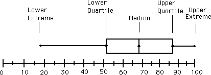
Minimum Q1 Median Q3 Maximum The five-number summary of a distribution leads to a new graph, the boxplot. Following is an example of how to construct a boxplot. Boxplots are also known as box-and-whiskers plots. A box-and-whisker plot can be useful for handling many data values. They allow people to explore data and to draw informal conclusions when two or more variables are present. It shows only certain statistics rather than all the data. Five-number summary is another name for the visual representations of the box-and-whisker plot. The five-number summary consists of the median, the quartiles, and the smallest and greatest values in the distribution. Immediate visuals of a box-and-whisker plot are the center, the spread, and the overall range of distribution.To construct a box-and-whisker plot we must find the median, the lower quartile, the upper quartile, the minimum, and the maximum of a given set of data. Example: The following set of numbers are the amount of marbles fifteen different boys own (they are arranged from least to greatest).18 27 34 52 54 59 61 68 78 82 85 87 91 93 100
35 is the interquartile range
Now we draw our graph.
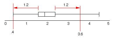
A boxplot also gives an indication of the symmetry or skewness of a distribution. In a symmetric distribution, the first and third quartiles are equally distant from the median. In most distributions that are skewed to the right, however, the third quartile will be farther above the median than the first quartile is below it. Likewise in left skewed distributions the first quartile will be farther below the median than the third quartile is above it. The extremes behave the same way, but remember that they are just single observations and may say little about the distribution as a whole. Outliers usually deserve special attention. Because the regular boxplot conceals outliers, we will adopt the modified boxplot, which plots outliers as isolated points. Example: Modified boxplotsData: 2.2 2.7 1.7 3.2 1.9 0.9 2.0 2.0 1.6 2.1 1.6 1.1 4.5 2.0 3.4 1.9 2.1 2.6 1.2 0.4 1.8 1.6 0.8 3.1 1.6 1.8 2.2 2.9 1.2 1.8 1.9 2.0 3.3 1.5 4.1 2.1 1.4 The five number summary is
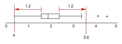
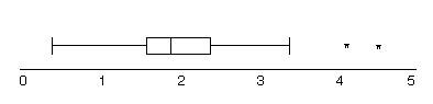
Min Q1 Median Q3 Max Modified boxplots attempt to identify possible outliers. Values are classified as outliers if they are more than a distance of 1.5 X(Q3 - Q1) above Q3 or below Q1 For our data this distance is 1.5X(2.4 - 1.6) = 1.5X(.8) = 1.2. Any value below 0.4 or above 3.6 is classified an outlier. 4.1 and 4.6 are outliers.
The whiskers of a modified boxplot extend to the last data value in this range and possible outliers are marked separately:
so we get
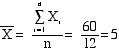
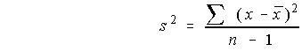
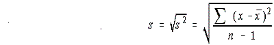
Because the modified boxplot shows more detail, when we say “boxplot” from now on, we will mean “modified boxplot.” Measuring spread: the standard deviation The five-number summary is not the most common numerical description of a distribution. That distinction belongs to the combination of the mean to measure center and the standard deviation to measure spread. The standard deviation measures spread by looking at how far the observations are from their mean.Before we define the standard deviation we must first look at another measure of dispersion or spread, the variance. Following is an example of how to calculate variance. Once the variance is calculated the standard deviation is simply the the positve square root of the variance.
Because the variance involves squaring the deviations, it does not have the same unit of measurement as the original observations. Lengths measured in centimeters, for example, have a variance measured in squared centimeters. Taking the square root remedies this. The standard deviation s measures spread about the mean in the original scale.If the variance is the average of the squares of the deviations of the observations from their mean, why do we average by dividing by n – 1 rather than n? Because the sum of the deviations is always zero, the last deviation can be found once we know the other n – 1 deviations. So we are not averaging n unrelated numbers. Only n – 1 of the squared deviations can vary freely, and we average by dividing the total by n – 1. The number n – 1 is called the degrees of freedom of the variance or of the standard deviation. Many calculators offer a choice between dividing by n and dividing by n – 1, so be sure to use n – 1. Leaving the arithmetic to a calculator allows us to concentrate on what we are doing and why. What we are doing is measuring spread. Here are the basic properties of the standard deviation s as a measure of spread. You may rightly feel that the importance of the standard deviation is not yet clear. We will see in the next chapter that the standard deviation is the natural measure of spread for an important class of symmetric distributions, the normal distributions. The usefulness of many statistical procedures is tied to distributions of particular shapes. This is certainly true of the standard deviation. Choosing measures of center and spread How do we choose between the five-number summary and
The five-number summary is usually better than the mean and
standard deviation for describing a skewed distribution or a distribution
with strong outliers. Use
Do remember that a graph gives the best overall picture of a distribution. Numerical measures of center and spread report specific facts about a distribution, but they do not describe its entire shape. Numerical summaries do not disclose the presence of multiple peaks or gaps, for example. Always plot your data.Try Self-Check 6 You are now ready for Statistics Assignment 3: Measures of Central Tendencies Review Measuring Center and Measuring Spread and take Multiple Choice 2.
|
||||||||||||||||||||||||||||||||||||||||||||||||||||||
|
© 2004 Aventa Learning. All rights reserved. | ||||||||||||||||||||||||||||||||||||||||||||||||||||||