| AP Statistics |
|
|
|
|
|
|
Inspecting Distributions Making a statistical graph is not an end in itself. After all, a computer or graphing calculator can make graphs faster than we can. The purpose of the graph is to help us understand the data. After you (or your calculator) make a graph, always ask, ōWhat do I see?ö Here is a general tactic for looking at graphs: Look for an overall pattern and also for striking deviations from that pattern.OVERALL PATTERN OF A DISTRIBUTION To describe the overall pattern of a distribution: Give the center and the spread. Ģ See if the distribution has a simple shape that you can describe in a few words.
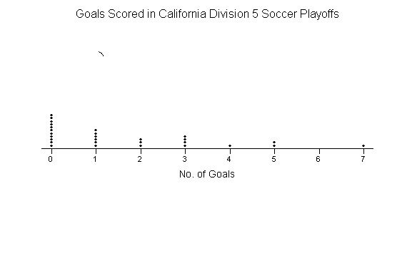
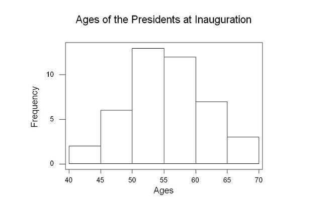
Figure 1.9 Section 6 will tell us in detail how to measure center and spread. For now, describe the center by finding a value that divides the observations so that about half take larger values and about half have smaller values. In Figure 1.9, the center is 1. That is, a typical team scored about 1 goal in its playoff soccer game. You can describe the spread by giving the smallest and largest values. The spread in Figure 1.9 is from 0 goals to 7 goals scored. The dotplot in Figure 1.9 shows that in most of the playoff games, Division V soccer teams scored very few goals. There were only four teams that scored 4 or more goals. We can say that the distribution has a ōlong tailö to the right, or that its shape is ōskewed right.ö You will learn more about describing shape shortly. Is the one team that scored 7 goals an outlier? This value certainly differs from the overall pattern. To some extent, deciding whether an observation is an outlier is a matter of judgment. We will introduce an objective criterion for determining outliers in Section 6. Once you have spotted outliers, look for an explanation. Many outliers are due to mistakes, such as typing 4.0 as 40. Other outliers point to the special nature of some observations. Explaining outliers usually requires some background information. Perhaps the soccer team that scored seven goals has some very talented offensive players. Or maybe their opponents played poor defense. Sometimes the values of a variable are too spread out for us to make a reasonable dotplot. OUTLIERS outlier in any graph of data is an individual observation that falls outside the overall pattern of the graph. Let's revisit the histogram of the presidential inauguration ages.
Here is a good interpretation of the graph. Center: It appears that the typical age of a new
president is about 55 years, because 55 is near the center of the histogram. Spread: As the histogram shows, there is a good deal of
variation in the ages at which presidents take office. Teddy Roosevelt was
the youngest, at age 42, and Ronald Reagan, at age 69, was the oldest. Shape: The distribution is roughly symmetric and has a
single peak (unimodal). Outliers: There appear to be no outliers. More about shape When you describe a distribution, concentrate on the main
features. Look for major peaks, not for minor ups and downs in the bars of
the histogram. Look for clear outliers, not just for the smallest and
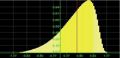
largest observations. Look for rough In mathematics, symmetry means that the two sides of a figure like a histogram are exact mirror images of each other. Data are almost never exactly symmetric, so we are willing to the call the presidential inauguration ages histogram approximately symmetric as an overall description. Here are more examples. SYMMETRIC AND SKEWED DISTRIBUTIONS A distribution is symmetric if the right and left sides of the histogram are approximately mirror images of each other.
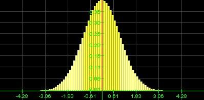
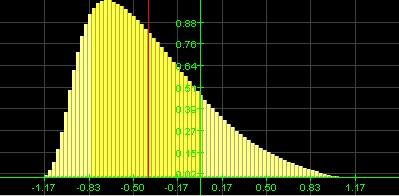
Symmetric A distribution is skewed to the right if the right side of the histogram (containing the half of the observations with larger values) extends much farther out than the left side. This type of distribution is also called positively skewed.
Skewed right It is skewed to the left if the left side of the histogram extends much farther out than the right side. This type of distribution is also called negatively skewed.
Skewed left Remember these basic shapes as they will
appear throughout the course.
Relative frequency, cumulative frequency, percentiles, and ogives Sometimes we are interested in describing the relative
position of an individual within a distribution. You may have received a
standardized test score report that said you were in the 80th percentile.
What does this mean? Put simply, 80% of the people who took the test earned
scores that were less than or equal to your score. The other 20% of students
taking the test earned higher scores than you did. PERCENTILE The
pth
percentile of a distribution is the value such that
p
percent of the observations fall at or below it. A histogram does a good job of displaying the distribution
of values of a variable. But it tells us little about the relative standing
of an individual observation. If we want this type of information, we should
construct a
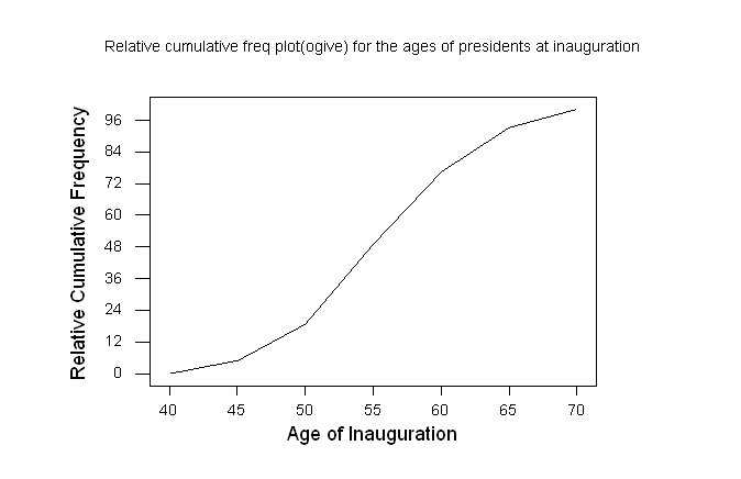
Recall the histogram of the ages of U.S. presidents when they were inaugurated. Now we will examine where some specific presidents fall within the age distribution. How to construct an ogive (relative cumulative frequency graph): Step 1: Decide on class intervals and make a frequency table, just as in making a histogram. Add three columns to your frequency table: relative frequency, cumulative frequency, and relative cumulative frequency.Ģ To get the values in the relative frequency column, divide the count in each class interval by 43, the total number of presidents. Multiply by 100 to convert to a percentage.Ģ To fill in the cumulative frequency column, add the counts in the frequency column that fall in or below the current class interval.Ģ For the relative cumulative frequency column, divide the entries in the cumulative frequency column by 43, the total number of individuals.Here is the frequency table from the presidential inauguration ages with the relative frequency, cumulative frequency, and relative cumulative frequency columns added.
Step 2: Label and scale your axes and title your graph. Label the horizontal axis ōAge at inaugurationö and the vertical axis ōRelative cumulative frequency.ö Scale the horizontal axis according to your choice of class intervals and the vertical axis from 0% to 100%. Step 3: Plot a point corresponding to the relative cumulative frequency in each class interval at the left endpoint of the next class interval. For example, for the 40¢44 interval, plot a point at a height of 4.7% above the age value of 45. This means that 4.7% of presidents were inaugurated before they were 45 years old. Begin your ogive with a point at a height of 0% at the left endpoint of the lowest class interval. Connect consecutive points with a line segment to form the ogive. The last point you plot should be at a height of 100%. The complete ogive is plotted below.
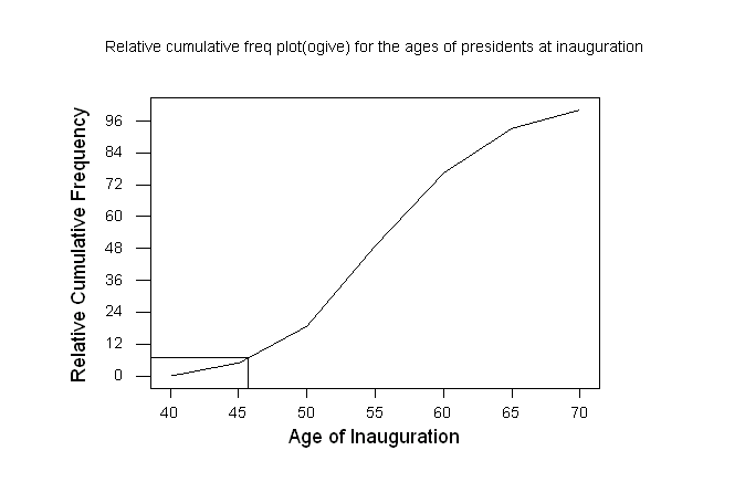
How to locate an individual within the distribution: What about Bill Clinton? He was age 46 when he took office. To find his relative standing, draw a vertical line up from his age (46) on the horizontal axis until it meets the ogive. Then draw a horizontal line from this point of intersection to the vertical axis. We would estimate that Bill ClintonÆs age places him at the 10% relative cumulative frequency mark. That tells us that about 10% of all U.S. presidents were the same age as or younger than Bill Clinton when they were inaugurated. Put another way, President Clinton was younger than about 90% of all U.S. presidents based on his inauguration age. His age places him at the 10th percentile of the distribution.
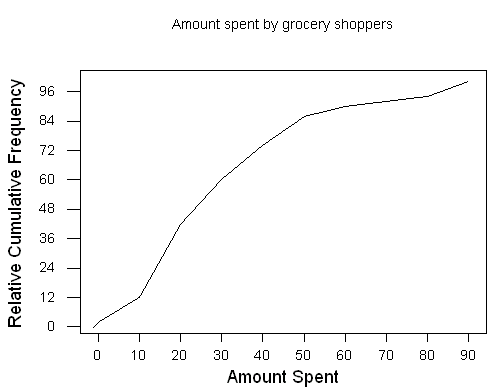
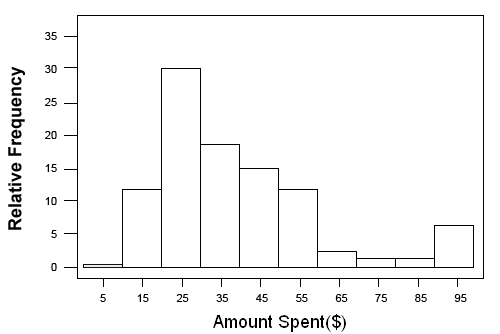
How to locate a value corresponding to a percentile: What inauguration age corresponds to the 60th percentile? To answer this question, draw a horizontal line across from the vertical axis at a height of 60% until it meets the ogive. From the point of intersection, draw a vertical line down to the horizontal axis. Find the center of the distribution. Since we use the value that has half of the observations above it and half below it as our estimate of center, we simply need to find the 50th percentile of the distribution. Estimating as for the previous question, confirm that 55 is the center. Try Self Check 4 Practice Problem: Here is an ogive of the amount spent by grocery shoppers.
(a) Estimate the center of this distribution. Explain your method.(b) At what percentile would the shopper who spent $17.00 fall?(c) Draw the histogram that corresponds to the ogive.Answers: a. To find the center of the distribution I would go to 50 on the y-axis (Relative Cumulative Frequency) since 50 represents the center and draw a horizontal line until it met the line of the ogive. At that point I would draw a vertical line to the x-axis (Amount Spent ($)). The estimate at this point is $27. b. 35th percentile
c.
|
||||||||||||||||||||||||||||||||||||||||
|
® 2004 Aventa Learning. All rights reserved. |