| AP Statistics |
|
|
|
|
|
|
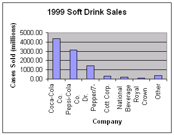
Displaying Distributions Displaying categorical variables: bar graphs and pie charts The values of a categorical variable are labels for the categories, such as "male" and "female." The distribution of a categorical variable lists the categories and gives either the count or the percent of individuals who fall in each category. Example: THE MOST POPULAR SOFT DRINK The following table displays the sales figures and market share (percent of total sales) achieved by several major soft drink companies in 1999. That year, a total of 9930 million cases of soft drink were sold.
How to construct a bar graph: Step 1: Label your axes and title your graph. Draw a set of axes. Label the horizontal axis "Company" and the vertical axis "Cases sold." Title your graph. Step 2: Scale your axes. Use the counts in each category to help you scale your vertical axis. Write the category names at equally spaced intervals beneath the horizontal axis. Step 3: Draw a vertical bar above each category name to a height that corresponds to the count in that category. For example, the height of the "Pepsi-Cola Co." bar should be at 3119.5 on the vertical scale. Leave a space between the bars in a bar graph. (See Figure 1.1a)
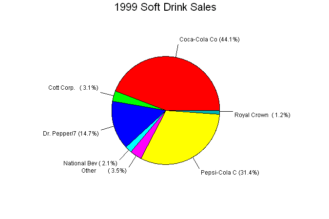
Figure 1.1a How to construct a pie chart: Use a computer! Any statistical software package and many spreadsheet programs will construct these plots for you. (See Figure 1.1b)
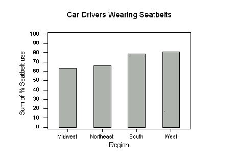
Figure 1.1b The bar graph in Figure 1.1a quickly compares the soft drink sales of the companies. The heights of the bars show the counts in the seven categories. The pie chart in Figure 1.1b helps us see what part of the whole each group forms. For example, the Coca-Cola "slice" makes up 44.1% of the pie because the Coca-Cola Company sold 44.1% of all soft drinks in 1999. Pie charts can be constructed by hand. Simply calculate the decimal equivalent for each slice and the multiply the decimal by 360 to obtain the degree measure for that slice. In the above example Royal Crown has a decimal equivalent of .012 (1.2%). Multiplying .012 by 360 yields 4.32 degrees. You would continue this process for all of the soft drinks listed. You may see that it would be difficult to draw the slices by hand so that is why using a computer is suggested. Bar graphs and pie charts help an audience grasp the distribution quickly. To make a pie chart, you must include all the categories that make up a whole. Bar graphs are more flexible. In 1998, the National Highway and Traffic Safety Administration (NHTSA) conducted a study on seat belt use. The table below shows the percentage of automobile drivers who were observed to be wearing their seat belts in each region of the United States. The graph shows the same information. Region Percent wearing seat belts Northeast 66.4 Midwest 63.6 South 78.9 West 80.8
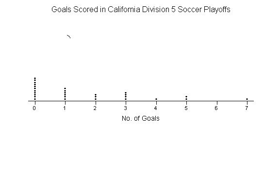
Figure 1.2 Drivers in the South and West seem to be more concerned about wearing seat belts than those in the Northeast and Midwest. It is not possible to display these data in a single pie chart, because the four percentages cannot be combined to yield a whole (their sum is well over 100%). Displaying quantitative variables: dotplots and stemplots Several types of graphs can be used to display quantitative data. One of the simplest to construct is a dotplot. The number of goals scored by each team in the first round of the California Southern Section Division V high school soccer playoffs is shown in the following table. 5 0 1 0 7 2 1 0 4 0 3 0 2 0 3 1 5 0 3 0 1 0 1 0 2 0 3 1 How to construct a dotplot: Step 1: Label your axis and title your graph. Draw a horizontal line and label it with the variable (in this case, number of goals). Title your graph. Step 2: Scale the axis based on the values of the variable. Step 3: Mark a dot above the number on the horizontal axis corresponding to each data value. Figure 1.3 displays the completed dotplot.
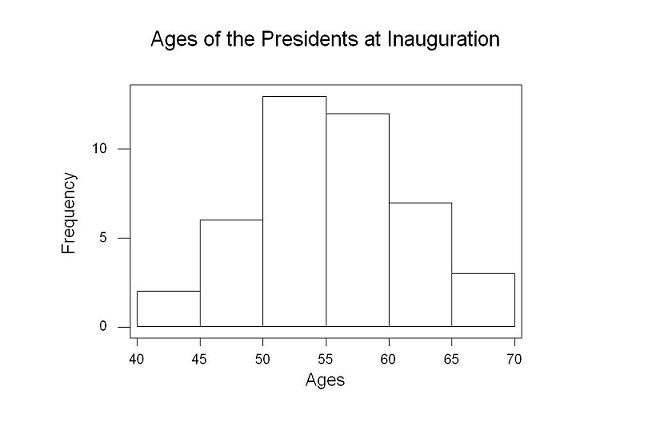
Figure 1.3 Investigating the dotplot it is clear zero was the most common number of goals scored. Dotplots give a quick view of the data and work especially well data that has a small range; this example only includes integral values from 0 to 7. Here are a few tips for you to consider when you want to construct a stemplot: ? There is no magic number of stems to use. Too few stems will result in a skyscraper shaped plot, while too many stems will yield a very flat "pancake" graph. ? Five stems is a good minimum. ? You can get more flexibility by rounding the data so that the final digit after rounding is suitable as a leaf. Do this when the data have too many digits. The chief advantages of dotplots and stemplots are that they are easy to construct and they display the actual data values (unless we round). Neither will work well with large data sets. Most statistical software packages will make dotplots and stemplots for you. That will allow you to spend more time making sense of the data. Deciding what kind of graph is best suited to displaying your data thus requires good judgment. Statistics is not just recipes! Try Self-Check 2 Displaying quantitative variables: histograms Quantitative variables often take many values. A graph of the distribution is clearer if nearby values are grouped together. The most common graph of the distribution of one quantitative variable is a histogram. Example: PRESIDENTIAL AGES AT INAUGURATION How old are presidents at their inaugurations? Was Bill Clinton, at age 46, unusually young? Table 3 gives the data, the ages of all US presidents when they took office. TABLE 3 Ages of the Presidents at inauguration
How to make a histogram: Step 1: Divide the range of the data into classes of equal width. Count the number of observations in each class. The data has a range from 42 to 69, so we choose as our classes 40 ≤ president's age at inauguration < 45 45 ≤ president's age at inauguration < 50 50 ≤ president's age at inauguration < 56 55 ≤ president's age at inauguration < 60 60 ≤ president's age at inauguration < 65 65 ≤ president's age at inauguration < 70 Be sure to specify the classes precisely so that each observation falls into exactly one class. This is done by making one of the inequalities in each of the statements above a "less than or equal to" inequality and the other a "strictly less than" inequality. Martin Van Buren, who was age 54 at the time of his inauguration, would fall into the third class interval. Grover Cleveland, who was age 55, would be placed in the fourth class interval. Now that we have determined how we will group the data into classes, we can create a frequency table of the data. Frequency tables display the number of times a class or group of numbers occurs in the data. Here is the frequency table showing the counts for each class interval: Class Count 40-44 2 45-49 6 50-54 13 55-59 12 60-64 7 65-69 3 Step 2: Label and scale your axes and title your graph. Label the horizontal axis "Ages" and the vertical axis "Frequency." For the classes we chose, we should scale the horizontal axis from 40 to 70, with tick marks 5 units apart. The vertical axis contains the scale of counts and should range from 0 to at least 15. Step 3: Draw a bar that represents the count in each class. The base of a bar should cover its class, be centered over the class mark (or midpoint of the interval), and the height of the bar is the class count. Leave no horizontal space between the bars (unless a class is empty, so that its bar has height 0). The figure below shows the completed histogram.
Histogram tips: ? There is no one right choice of the classes in a histogram. Too few classes will give a "skyscraper" graph, with all values in a few classes with tall bars. Too many will produce a "pancake" graph, with most classes having one or no observations. Neither choice will give a good picture of the shape of the distribution. ? Five classes is a good minimum. ? Our eyes respond to the area of the bars in a histogram, so be sure to choose classes that are all the same width. Then area is determined by height and all classes are fairly represented. ? If you use a computer or graphing calculator, beware of letting the device choose the classes. Try Self-Check 3 Summary We have just looked at 5 ways to display data. By no means is this exhaustive as there are other ways to graphically display data. For categorical data we looked at a bar graphs (also known as bar charts) and pie charts. These charts are used when the data are declared categorical (color, shape, gender, names, etc.). Next we looked at stem plots and dot plots. These type of graphs are used to graph small data sets. There is no true definition of small data sets. When plotting a dot plot by hand it will become increasing harder to keep an even spacing above each value. Either move to a computer program or consider changing to a histogram. The same could also be said for a stem plot. The Pittsburgh Steelers stem plot example may be a little large to do by hand but it is doable. Every point in the data set can be obtained from a dot plot or a stem plot. On the other hand histograms are graphs where quantitative data is grouped into classes. When the data is grouped into classes the individuality of data points is lost. This is not necessarily a bad feature as we move on to study the meaning of the shapes of graphs. You are now ready for Statistics Assignment 2: Working with Graphs Review the content and take Multiple Choice 1.
|
||||||||||||||||||||||||||||||||||||||||||||||||||||||||||||||||||||||||||||||||||||||||||||||||||||||||||||