|
Comparing
Distributions
In this unit we have looked at graphs for one variable and with the
exception of comparing touchdown passes by NFL teams we have focused on
single graphs. In a lot of cases graphs are used to do comparison of data
sets. Just like the example of NFL touchdowns one can see that visually
comparing two or more graphs would let us draw some simple conclusions. Now
that you have an understanding of basic summary statistics along with being
able to measure center and spread you should now be able to interpret
graphs. Remember that the graph doesn't tell the whole story just the same
as the summary statistics lack a visual representation.
Some common graphs used for comparison include side-by-side boxplots,
back-to-back stem and leaf graphs, and side-by-side bar graphs. This
list is not exhaustive but it does encompass the most common comparison
graphs.
Here is the comparison of the NFL TD passes data listed in the Displaying
Distribution lesson.
Side-by-side boxplots
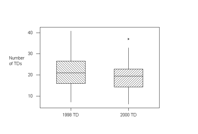
This graph was generated on Minitab, a powerful statistics
graphing and analysis program. The modified boxplots were drawn vertically.
Earlier boxplots were horizontal in orientation. Does it matter which
direction? Of course not! You can draw the same conclusion regardless of the
orientation of the boxplots.
Looking at the graphs it shows that in general there were more TD passes
per team in 1998 than in 2000. The IQR was smaller in 2000 than 1998
which led to 37 being an outlier. In 1998 37 would not have been an outlier.
Just because one data set has higher values than the other does not give an
indication of outliers. Remember to graph the data and then do the
calculations to verify outliers.
Here is a self-check question comparing male and female weights.
Question:
The weights of the male and female students in a class are summarized in
the following boxplots:
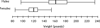
Which of the following is NOT correct?
- About 50% of the male students have weights between 150 and 185 lbs.
- About 25% of female students have weights more than 130 lbs.
- The median weight of male students is about 162 lbs.
- The mean weight of female students is about 120 because of symmetry.
- The male students have less variability than the female students.
Which answer did you select? The correct answer is "e". The first four
choices are all correct.
Back-to-back stem and leaf plots. Below is a back-to-back stem and
leaf plot of the NFL TD passes data. With the data presented in this manner
it is easy to make comparisons. Is this back-to-back stem and leaf plot
better than the modified boxplots above? You can make the same
comparisons but you could "see" the five number summary on the boxplot but
the stem and leaf plot lets you view all of the data.
1998 TD passes 2000 TD passes
| 11 |
|4| |
|
| |
|3| |
7 |
| 332 |
|3| |
233 |
| 8865 |
|2| |
889 |
|
44331110 |
|2| |
001112223 |
|
987776665 |
|1| |
56888899 |
| 321 |
|1| |
22444 |
| 7 |
|0| |
69 |
Back-to-back bar graphs can be found from time to time.
They are used for when each data group contains two different sets of
frequency data. A double bar graph is used to compare both between and
within data groups. ( Note:
You can have cases where there are more than two bars per data group. We
will limit our discussion here to double bar graphs. However, you can apply
the same information to bar graphs with multiple bars per data group.)
Below is an example of a table that has two frequency data values per
data group.
Quarterly
Reports of Income and Expenses for
Dry Cleaning Associates and Co.
| Quarter |
Income
(thousands of dollars) |
Expenses
(thousands of dollars) |
| First Quarter |
57
|
39
|
| Second Quarter |
107
|
80
|
| Third Quarter |
73
|
78
|
| Fourth Quarter |
118
|
82
|
Double bar graphs have many of the same attributes and advantages of
regular bar graphs, however there are some major difference:
Similarities between double bar graphs and single
bar graphs:
- They are relatively easy to construct, they display facts about
countable data.
- They show comparisons between different data groups.
The major difference between double bar graphs and
single bar graphs:
- Double bar graphs allow us to make quick generalizations about
differences within data groups as well as between data groups.
- Each data group is represented by two bars.
Now let's look at the bar graph that illustrates the data presented in
the table above. Note that there are two bars for each data group, and they
are placed next to each other on the graph.
Quarterly Reports of Income and
Expenses for
Dry Cleaning Associates and Co.
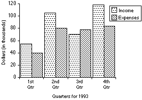
When reading double bar graphs, we often want to look at the
difference in heights between the two data bars within one group. For
example, the difference between the income and expenses bars for each
individual quarter tells you the profit for that quarter (profit = income
– expenses). By paying attention, not only to
individual bar heights, but differences between bar heights, you can make
more generalizations from double bar graphs. Let's use the bar graph above
to answer some questions
- Is it true that if the Dry Cleaning
Associates' income is over 60 thousand dollars, then their expenses are
also over 60 thousand dollars? Explain your answer.
Yes, this is true. The income is over 60
thousand dollars in the 2nd, 3rd, and 4th quarters. For each of those
quarters we can see that the expenses are also over 60 thousand dollars,
approximately 80 thousand dollars during each quarter.
- In what quarters did the company experience
its biggest profit and the biggest loss? Approximate both values.
To answer this question we must compare the value of the income to
expenses for each pair of bars, by quarter. Since the bigger the
difference is between income and expenses, the larger the profit, we must
observe in which quarter this difference is greatest. Visually we can
determine that the greatest profit occurs in the 4th quarter. Now we must
approximate this profit. Since the income is about 115 thousand and the
expenses are about 80 thousand, a good estimate of the profit is 115
– 80 = 35 thousand dollars.
The only quarter in which the expenses were bigger than the income is the
third quarter. Income – expenses = profit,
and income is about 70 thousand, while expenses are about 75 thousand.
Therefore, 70 – 75 = –5.
We can see that there is a negative profit level, which represents a loss
of 5 thousand dollars in the third quarter.
- Overall, did the Dry Cleaning Associates
experience a profit or a loss for the year?
We can see that in three of the four quarters, income was greater than
expenses. Overall, there was a profit, because the amount lost in the
third quarter is not nearly as much as the amount gained in the other
three quarters. The graph does not tell us precisely how much is gained or
lost, but it does gives us a good estimate, as well as a strong sense of
any trends that have occurred.
Comparing Distribution Applet
Your response times on a simple motor task are recorded under two
conditions. Various statistics and graphs used to compare the
distributions are presented. Click on the following link to check your
response time and view the summary statistics side by side.
 Comparing Distribution Applet
We have come to the end of the first unit. This unit contains a lot of
basic information that we will carry forth this year. Please review the
content, self-checks, multiple choice, and returned statistics assignments
to prepare for the Unit test.
Post any questions or concerns to the discussion board. If another
student doesn't answer your question or concern I will.
Once you have completed your review proceed to the Unit 1 exam. it has
two parts, multiple choice and free response. You will take the multiple
choice on line, 12 questions, 25 minutes. You will download the free
response and fax your responses to me, the same process as the assignments.
Proceed to the Unit 1 Exam Multiple Choice and Free Response |