- Introduction
 Learn
Learn- Try It
- Task
Learn
|
Before we start the lesson, read the definitions of vocabulary that will be introduced in the lesson.
Watch Aggregate Demand Graphs.
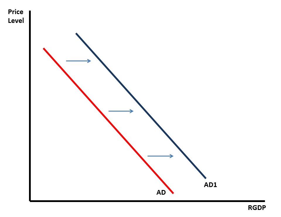
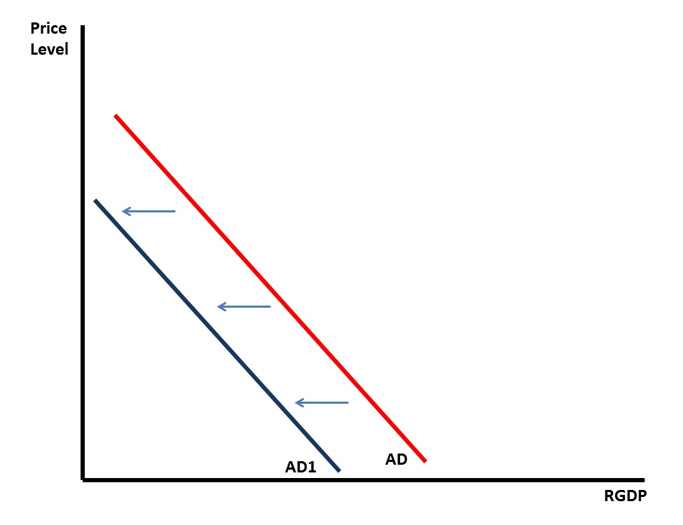
Earlier in the course, you learned that the economy goes through a business cycle. It is the interaction of the Aggregate Demand and Aggregate Supply curves, and the changes in each curve, that explain periods of growth and recession in the economy. Watch EconEd: Aggregate Demand to learn the basics of the aggregate demand curve. An increase in Aggregate Demand is a shift of the curve to the right (the graph on top), while a decrease in Aggregate Demand is a shift of the curve to the left (the graph on bottom).
The determinants which shift the Aggregate Demand curve are summarized in the table below.
Watch EconEd: Aggregate Supply to learn the basics of Aggregate Supply. Watch Aggregate Supply Graphs. Transcript
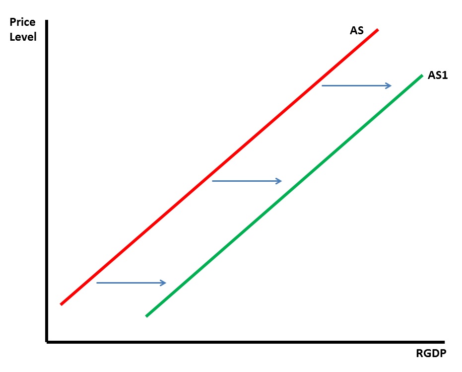
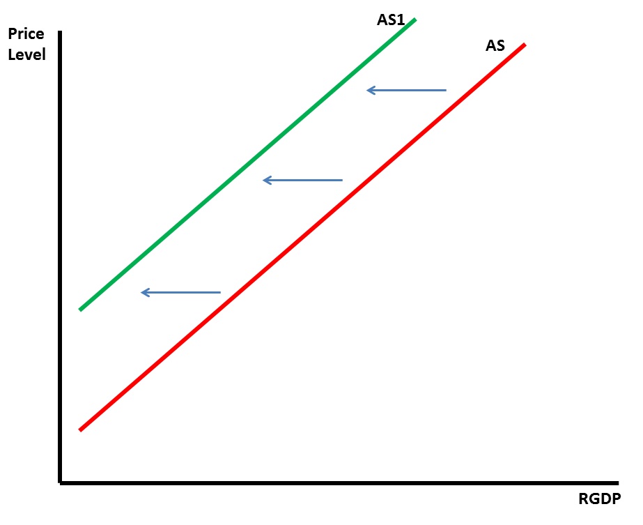
An increase in Aggregate Supply is a shift of the curve to the right (the graph on top), while a decrease in Aggregate Supply is a shift of the curve to the left (the graph on bottom).
The determinants which shift the Aggregate Supply curve are summarized in the table below.
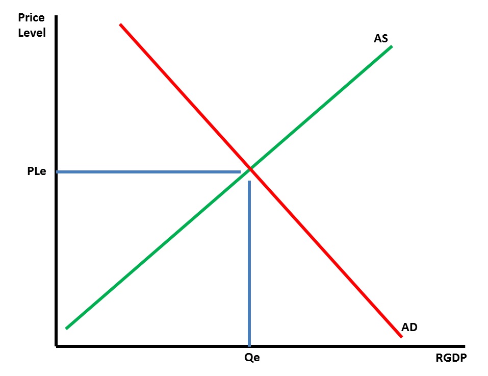
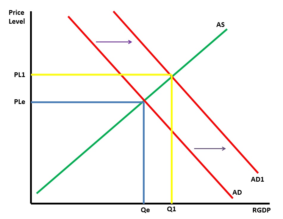
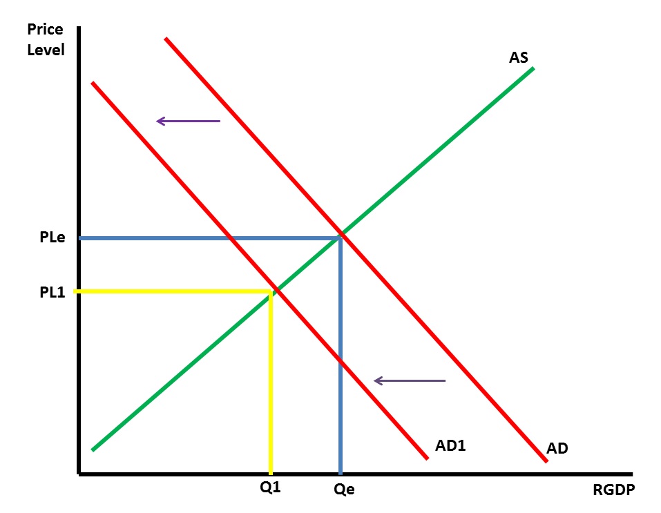
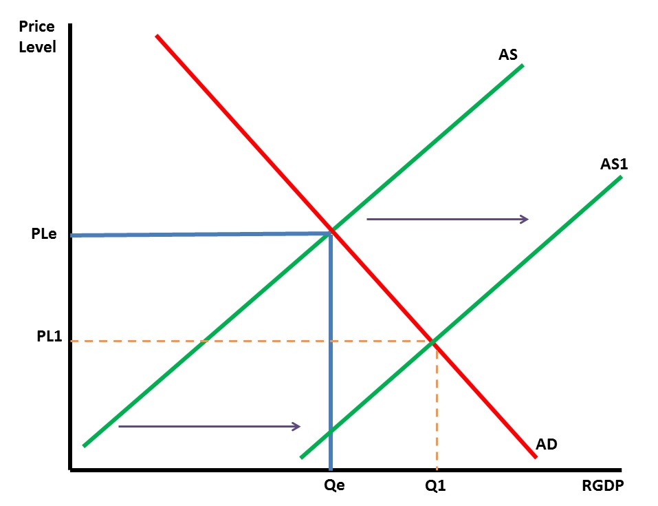
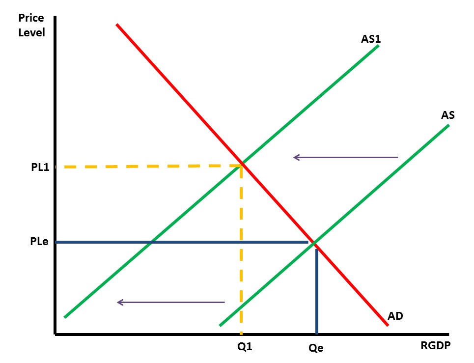
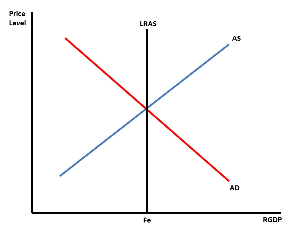
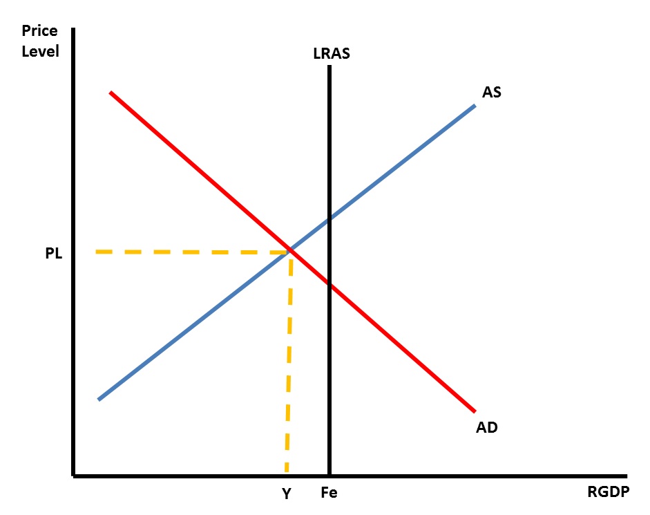
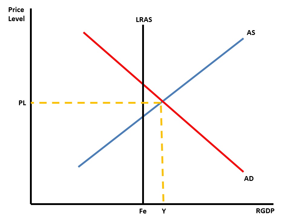
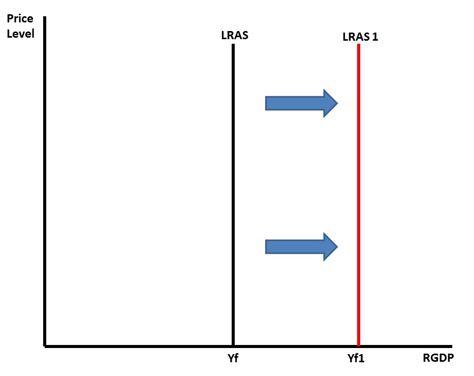
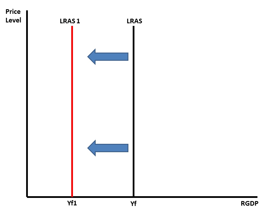
Watch Equilibrium Graphs. Putting the Aggregate Demand and Aggregate Supply curves together shows the equilibrium point of Price Level and Quantity of RGDP. Knowing where equilibrium begins, represented by PLe and Qe, we can now identify what happens to Price Level and Output with changes in Aggregate Demand and Aggregate Supply. The graph below shows an increase in Aggregate Demand with Aggregate Supply staying the same. Identifying the new Price Level as PL1 and the new Output as Q1, we see that the price level and output have both increased. To produce more goods businesses will have to hire more workers so employment will increase. The graph below shows an decrease in Aggregate Demand with Aggregate Supply staying the same. Identifying the new Price Level as PL1 and the new Output as Q1, we see that the price level and output have both decreased. To produce less goods businesses will have to hire fewer workers so employment will decrease. The graph below shows an increase in Aggregate Supply with Aggregate Demand staying the same. Identifying the new Price Level as PL1 and the new Output as Q1, we see that the price level has decreased while the output has increased. To produce more goods businesses will have to hire more workers so employment will increase. The graph below shows a decrease in Aggregate Supply with Aggregate Demand staying the same. Identifying the new Price Level as PL1 and the new Output as Q1, we see that the price level has increased while the output has decreased. To produce less goods businesses will hire fewer workers so employment will decrease. It is now time to introduce the Long Run Aggregate supply curve. This graph is located below. This curve is a vertical line that represents the full employment of resources. When the economy is at equilibrium the AS and AD curves intersect over the LRAS curve, like in the graph below. To show graphically what a recession looks like we draw the short run equilibrium to the left of full employment. In this situation the output in the economy has decreased. With a decrease in output businesses don't need as many workers so unemployment increases. With the decrease in employment and economic activity the price level in the economy will tend to be lower. This situation is represented graphically below. To show graphically what inflation in an economy looks like we draw the short run equilibrium to the right of full employment. In this situation the output in the economy has increased. With an increase in output businesses have to pay more to workers and other resources since both are in short supply. In this situation price level, output and employment all increase. This situation is represented graphically below. What factors change the LRAS curve? Generally the factors that change the SRAS curve will move the LRAS curve. The general difference is whether or not the factors have an effect for enough time to have changes take place. For instance, a bad storm that destroys businesses will cause a shift in the SRAS curve, however, it won't be long until the businesses are up and running again. Changes in the LRAS would be unlikely. On the other hand an increase in immigration will cause the SRAS curve and LRAS curve to shift. The new labor resources would add a short term and long term addition to the Aggregate Supply because of the increase in resources. Just like with the supply curve an increase in the LRAS for a country is a shift of the LRAS curve to the right. A decrease in the LRAS curve is a shift of the curve to the left.
|