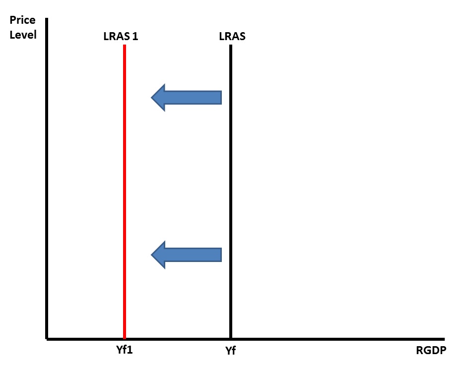
This graph is simply of a vertical long-run aggregate supply curve which runs parallel to the vertical price level axis. The original LRAS curve is labeled Yf on the horizontal real GDP line which symbolizes real GDP output at full employment. There is a second vertical LRAS curve which runs parallel to the vertical price level axis and the original LRAS curve. This new LRAS curve is labeled Yf1 on the horizontal RGDP line. The new curve is located to the left of the original LRAS curve indicating that the economy is producing at a lower level of efficiency. It is a manifestation of the retreat of an economy inside the production possibilities frontier or PPF that you learned about earlier. The movement of the LRAS to the left might be in response to a deterioration of resource quality, a decrease in resource quantity, or a decline in quality of one of the factors of production. The movement is generally gradual for example in the case of the increase in retirement of the aging World War II Baby-Boom population.