Lesson
Typography
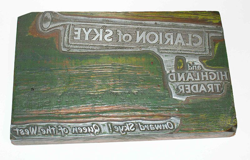
In the early days of newspapers, type (the letters, literally) was set by hand. Every single letter was on a tiny tile. Think of those rubber stamps sold in hobby stores for scrapbooking to get the general idea. Not only was each letter on its own little raised surface, it was reversed so that it would print out in readable form.

Image courtesy of inductiveload.
This is a masthead for an old paper. Can you figure out the paper's name?
Answer: The masthead reads: Clarion of Skye and Highland Trader Onward Sky! Queen of the West
Character
The journalist-craftsman would use tweezers to place each letter character in line to prepare it for the printing press. A character is an individual letter, piece of punctuation, or space. Placing the tiles would be drudgery enough, but imagine having to "write" each line backwards! Maddening!
Image courtesy of DMahalko.
Can you read this type? Hint: Think advertising slogan.
Answer: This type reads "Nothing runs like a Deere." Did you notice the error in the first line. It was probably pretty easy to make mistakes when you are reading backwards....
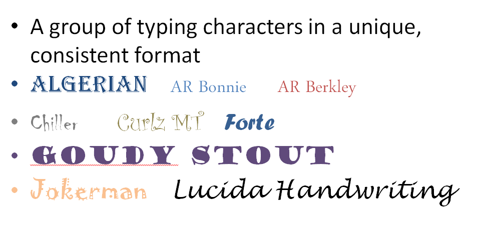
Today, thanks to digital technology, we have thousands of options and can change the "look" of the type with a mouse click. The problem with this creative freedom is that young journalists have a difficult time keeping their fonts consistent.
Font
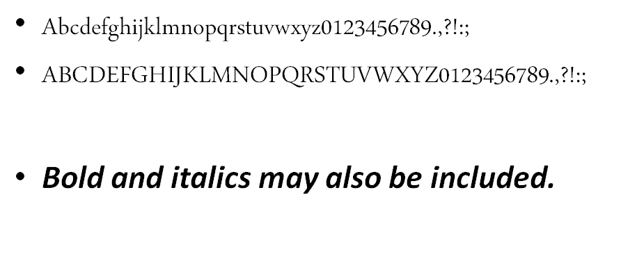
A font is a specific style for an alphabet set…upper case, lower case, italic, bold, punctuation, special characters. Every character within that alphabet set follows the same pattern or look. Thousands of fonts are available.
Although many fonts are pretty, unique, cute, or entertaining, newspaper readers expect the type to be easily readable. They also use the font choice as a visual clue for what type of item they are reading or researching. So, can you get creative with type? Sure! You just need to keep your creativity consistent, appropriate, and readable.

Look at the three headlines on this page. Are they all in the same font? Which one seems most serious? Most light?
For instance, use the same font for all of your captions or use a specific font for sidebar copy. Typographical elements can be particularly effective on feature pages.
Before we start exploring the exciting world of typography, let's become acquainted with some of the terminology associated with the printed word.

Look at the newspaper sidebar. Do you see a pattern in the fonts used?
More on Typography and Fonts

AR Berkley Font Family

Pica
- A pica is a unit of measurement in type.
- 6 picas = 1 inch
Point
- A point is a unit of measurement in type.
- 12 points = 1 pica
- If 12 points = 1 pica and 6 picas = 1 inch, how many points are in an inch?
- Try setting this up as a multiplication problem. 12 × 6 = ?
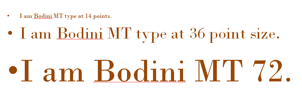
- 12 points/pica × 6 pica/inch = 72 points in each inch
Display Type
- Larger type, 14 points or bigger
- Headlines

Body Type
- Smaller sized type, typically used for copy/articles.
- 9-12point
- I am Arial font in 9 point type.
- I am Arial font in 12 point type.
Agate Type
- The smallest sized type, typically used for classified ads or sports statistics.
- 5-6 point
- I am Times New Roman Font in 6 point.
Alignment
- Alignment refers to where within the column of space your typing will appear. You might also hear this term called justification.
Left Justified Alignment
This text is left justified. Notice how the lines start in the same place on the left-hand margin. The right-hand margin will be uneven, or jagged. When you handwrite or type an essay, for instance, you use left justified alignment. You can tab on the opening sentence of each paragraph and still be left justified. The tab is the indent of the first line of a paragraph.
Center Justified Alignment
Center justified alignment is when text is centered in the middle of the page. Every line start from the centerpoint and works its way outward to your margins.
This alignment works great for poetry and for headlines. If you center justified your article, however, it would confuse your readers because of all the odd spacing.
- invitations
- greeting cards
- certificates
Right Justified Alignment
Right justified means the text aligns to the right of the page. The right hand margin will be consistent, but the left-hand margin will be jagged.
This alignment is not used as often because it creates unsightly white space at the beginning of lines of type. Since we read from left to right, this creates some visual confusion.
Force Alignment
Force alignment creates a clean, straight margin on both the left and right side of your column of text, but at a high price. Yes, you get pretty, straight columns with no ragged edges, but to do this the computer will automatically add spaces in between words. If you don't notice it onscreen, you will in print. It looks like someone pressed the space bar randomly throughout the writing. Uggh!
- newspaper columns
- magazines
Bullets
Visual symbols that mark paragraph entries or help make lists of information more visible.
Other bullets:

Feature Bullets
- If appropriate, you can use a graphic as a bullet.
- A list of ways to spread Christmas cheer might use Santa's image as bullets, for example.
Drop Caps
The first letter of your article is larger so that the reader's eye will "drop" into the article. This is a typical feature in magazines.

