| AP Statistics |
|
|
|
| Sections: 1.| Transforming Relationships 2.| Cautions about Correlation and Regression 3| Relations in Categorical Data |
|
|
|
Transforming Relationships We will see in this section that understanding how simple functions work helps us choose and use transformations. Applying a function such as the logarithm or square root to a quantitative transforming variable is called transforming or reexpressing the data. Because we may want to transform either the explanatory variable x or the response variable y in a scatterplot, or both, we will call the variable t when talking about transforming in general.Transforming data amounts to changing the scale of measurement that was used when the data were collected. We can choose to measure temperature in degrees Fahrenheit or in degrees Celsius, distance in miles or in kilometers. These changes of units are linear transformations, discussed earlier in the course.Linear transformations cannot straighten a curved relationship between two variables. We will resort to functions that are not linear.
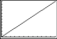
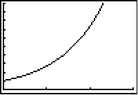
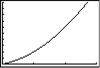
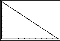
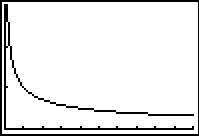
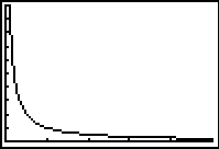
The transformations we have mentioned�linear, positive and negative powers, and logarithms�are those used in most statistical problems. They are all monotonic. MONOTONIC FUNCTIONS monotonic function f(t) moves in one direction as its argument t increases. A monotonic increasing function preserves the order of data. That is, if a > b, then f(a) > f(b).A monotonic decreasing function reverses the order of data. That is, if a > b, then f(a) < f(b).The graph of a linear function is a straight line. The graph of a monotonic increasing function is increasing everywhere. A monotonic decreasing function has a graph that is decreasing everywhere. A function can be monotonic over some range of t without being everywhere monotonic. For example, the square function t2 is monotonic increasing for t > 0. If the range of t includes both positive and negative values, the square is not monotonic�it decreases as t increases for negative values of t and increases as t increases for positive values. The figure below compares monotonic increasing functions and monotonic decreasing functions for positive values of the argument t. Many variables take only 0 or positive values, so we are particularly interested in how functions behave for positive values of t. The increasing functions for t > 0 are
Linear a + bt, slope b > 0 Square t2
Logarithm log t Exponential be t
Quadratic t2 + t + b Power atb The decreasing functions for t > 0 in the lower panel of the figure above are
Linear a + bt, slope b < 0 Reciprocal square root 1 / √t or t -1/2
Nonlinear monotonic transformations change data enough to alter the shape of distributions and the form of relations between two variables, yet are simple enough to preserve order allow recovery of the original data. We will concentrate on powers and logarithms. The even-numbered powers t2, t4, and so on are monotonic increasing for t > 0, but not when t can take both negative and positive values. The logarithm is not even defined unless t > 0. Our strategy for transforming data is therefore as follows:If the variable to be transformed takes values that are 0 or negative, first apply a linear transformation to make the values all positive. Often we just add a constant to all the observations. 2. Then choose a power or logarithmic transformation that simplifies the data, for example, one that approximately straightens a scatterplot.Table of Common Transformations Example: The data at the below shows the cooling temperatures of a freshly brewed cup of coffee after it is poured from the brewing pot into a serving cup. The brewing pot temperature is approximately 180� F.
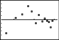
First graph the data and check to see if a linear model is appropriate.
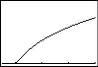
It is obvious that a linear model is not appropriate. It is now time to try some transformations. The plot has a gentle downward curve. Let's transform the response variable, temperature, by taking the natural log.
There is still a slight curvature in the graph. Let's take the natural log of the explanatory variable, time, and use the real values for temperature.
The graph now looks linear. Check out the same graph with the line of best fit superimposed.
Even though the fit is not perfect we have a good fit and a high r2, 99.4%. The equation that transforms the data to a linear model is given by Temp = 222.161 - 30.9843 Ln Time. We now have an equation that can be used to make predictions. What is the predicted temperature when t = 8 seconds? Temp = 222.161 - 30.9843(Ln 8) = 157.73 � F How close is this to the actual temperature collected for 8 seconds in the data table? The reported value was 158.1 � F, a difference of 0.37 � F. Following is original table with the predicted values added. Checking the third column with the second column shows a decent "match". Why does the first cell in the last column have an *? The reason is the natural log of 0 is undefined. Be careful when making transformations where some of the values may be undefined by the transforming function.
Check the normal probability plot.
This is not a perfect model by any means but it give a fair linear model based on transforming the data. Linear models allow us to predict because of their constancy, i.e., a constant slope. Another way to use the equation is to calculate the time based on a given temperature. For example, what is the time at which the temperature is 120 � F? 120 � F = 222.161 - 30.9843(Ln t) where t is the natural log of the unknown time. 120 -222.161= - 30.9843(Ln t) -102.161 = - 30.9843(Ln t) -102.161/-30.9843 = Ln t 3.3972 = Ln t This is not the answer! The value 3.3972 must be backed transformed from the natural log. e3.3972 = t = 29.88 seconds Make sure you always do the final back transformation. Besides the transformations mentioned above you may run across a graph that needs more than one transformation. These are called complex.
To handle these type of situations break the data into two or more groups and perform transformations on the each group. Try Self Check 18 Proceed to AP
Statistics Assignment 8: Transforming Data
It is much more satisfactory to begin with a theory or mathematical model
that we expect to describe a relationship. The transformation needed to make
the relationship linear is then a consequence of the model. One of the most
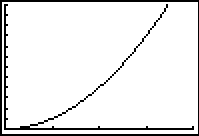
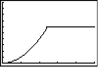
common models is Table of Common Transformations Exponential growth A variable grows linearly over time if it adds a fixed increment in each equal time period. Exponential growth occurs when a variable is multiplied by a fixed number in each time period. To grasp the effect of multiplicative growth, consider a population of bacteria in which each bacterium splits into two each hour.Beginning with a single bacterium, we have 2 after one hour, 4 at the end of two hours, 8 after three hours, then 16, 32, 64, 128, and so on. These first few numbers are deceiving. After 1 day of doubling each hour, there are 2 24 (16,777,216) bacteria in the population. That number then doubles the next hour! Try successive multiplications by 2 on your calculator to see for yourself the very rapid increase after a slow start. The figure below shows the growth of the bacteria population over 24 hours.
For the first 15 hours, the population is too small to rise visibly above the zero level on the graph. It is characteristic of exponential growth that the increase appears slow for a long period, then seems to explode. LINEAR VERSUS EXPONENTIAL GROWTH increases by a fixed amount in each equal time period. Exponential growth increases by a fixed percentage of the previous total.The logarithm transformation The growth curve for the number of cell phone subscribers does look somewhat like the exponential curve in bacteria example above, but our eyes are not very good at comparing curves of roughly similar shape. We need a better way to check whether growth is exponential. If you suspect exponential growth, you should first calculate ratios of consecutive terms. In Table below, we have divided each entry in the �Subscribers� column (the y variable) by its predecessor, leaving out both the first value of y, because it doesn�t have a predecessor, and the second value, because the x increment is not 1. Notice that the ratios are not exactly the same, but they are approximately the same.Ratios of consecutive y-values and the logarithms of the y-values for the cell phone data y) 1990 5,283 � 3.72288 1993 16,009 � 4.20436 1994 24,134 1.51 4.38263 1995 33,786 1.40 4.52874 1996 44,043 1.30 4.64388 1997 55,312 1.26 4.74282 1998 69,209 1.25 4.84016 1999 86,047 1.24 4.93474 The next step is to apply a mathematical transformation that changes exponential growth into linear growth�and patterns of growth that are not exponential into something other than linear. But before we do the transformation, we need to review the properties of logarithms. The basic idea of a logarithm is this: log 28 = 3 because 3 is the exponent to which the base 2 must be raised to yield 8. Here is a quick summary of algebraic properties of logarithms:ALGEBRAIC PROPERTIES OF LOGARITHMS bx = y if and only if by = x The rules for logarithms are 1. log(AB) = logA + logB2. log(A/B) = logA � logB3. log Xp = p logXPrediction in the exponential growth model Regression is often used for prediction. When we fit a least-squares regression line, we find the predicted response y for any value of the explanatory variable x by substituting our x-value into the equation of the line. In the case of exponential growth, the logarithms rather than the actual responses follow a linear pattern. To do prediction, we need to �undo� the logarithm transformation to return to the original units of measurement. The same idea works for any monotonic transformation. There is always exactly one original value behind any transformed value, so we can always go back to our original scale.Make sure that you understand the big idea here. The necessary transformation is carried out by taking the logarithm of the response variable. Your calculator and most statistical software will calculate the logarithms of all the values of a variable with a single command. The essential property of the logarithm for our purposes is that it straightens an exponential growth curve. If a variable grows exponentially, its logarithm grows linearly.Power law models When you visit a pizza parlor, you order a pizza by its diameter, say 10 inches, 12 inches, or 14 inches. But the amount you get to eat depends on the area of the pizza. The area of a circle is π times the square of its radius. So the area of a round pizza with diameter x isarea = πr2 = π(x/2)2 = π(x2/4) = (π/4)x2This is a power law model of the formy = axpWhen we are dealing with things of the same general form, whether circles or fish or people, we expect area to go up with the square of a dimension such as diameter or height. Volume should go up with the cube of a linear dimension. That is, geometry tells us to expect power laws in some settings. Biologists have found that many characteristics of living things are described quite closely by power laws. There are more mice than elephants, and more flies than mice�the abundance of species follows a power law with body weight as the explanatory variable. So do pulse rate, length of life, the number of eggs a bird lays, and so on. Sometimes the powers can be predicted from geometry, but sometimes they are mysterious. Why, for example, does the rate at which animals use energy go up as the 3/4 power of their body weight? Biologists call this relationship Kleiber�s law. It has been found to work all the way from bacteria to whales. The search goes on for some physical or geometrical explanation for why life follows power laws. There is as yet no general explanation, but power laws are a good place to start in simplifying relationships for living things.Exponential growth models become linear when we apply the logarithm transformation to the response variable y. Power law models become linear when we apply the logarithm transformation to both variables. Here are the details:The power law model is y = axp2. Take the logarithm of both sides of this equation. You see thatlog y = log a + p log xThat is, taking the logarithm of both variables straightens the scatterplot of y against x.3. Look carefully: The power p in the power law becomes the slope of the straight line that links log y to log x.Prediction in power law models If taking the logarithms of both variables makes a scatterplot linear, a power law is a reasonable model for the original data. We can even roughly estimate what power p the law involves by regressing log y on log x and using the slope of the regression line as an estimate of the power. Remember that the slope is only an estimate of the p in an underlying power model. The greater the scatter of the points in the scatterplot about the fitted line, the smaller our confidence that this estimate is accurate.Transformations require patience and practice. Do be overwhelmed by all of the possibilities. Just approach each problem methodically and you will arrive at a reasonable solution. Example
The true antelopes are found only in Africa and Asia. They range in size from the pygmy antelopes, which are 12 inches (30 cm) high at the shoulder, to the giant elands, which are over 6 feet (180 cm) high at the shoulder. Most antelopes stand between 3 to 4 feet (90-120 cm) high at the shoulder. The horns of antelopes, unlike the antlers of deer, are unbranched, are made of a chitinous shell with a bony core, and are not shed. The majority of antelopes reside in Africa..
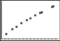
This is the graph of the raw data, notice the slight curvature.
To straighten this curve take the natural log of both the x and y variable. Below left is the new transformed graph. Also displayed is the linear regression statistics for the transformed data. Notice the high r value.
The linear equation for the transformed data is ln y = 3.183 + .6595 ln x You can convert this to a power equation, y = 24.1299x0.6595 Substituting 49 for x the y value is 314.2 mm. You can also substitute 49 in the linear equation and arrive at the same answer.
It would to laborious to go through every type of transformation. Do be afraid to try different methods but keep in mind the reason for the transformation. The goal is to produce a linear model that can be used to make predictions.
Try Self Check 19 |
|||||||||||||||||||||||||||||||||||||||||||||||||||||||||||||||||||||||||||||||||||||||||||||||||||||||||||||||