
- Introduction
- Lesson
 Review & Tasks

Answer the questions below. Submit your answers in a Word document to the 0.02 Graphs and Charts Dropbox.
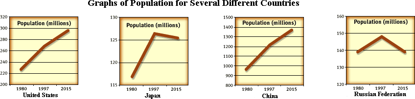
1. Which countries will probably show population decreases between 1997 and 2015?
2. Which country had the greatest population in 1997?
3. Is the increase in the United States population estimated to be greater between 1980 and 1997 or between 1997 and 2015?
Use the chart below to answer the following questions.
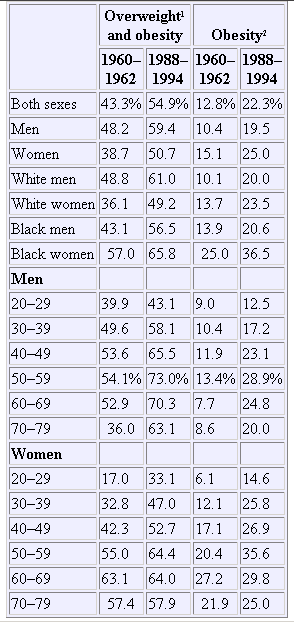
4. What happened to the percentage of overweight Americans from 1962 to 1994?
5. Which age group of women showed the smallest amount of increase in obesity?
6. Which age group for men showed the largest increase for obesity?
Use the graph below to answer the following questions.
7. What does this graph show?
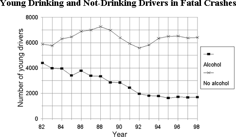
8. How many young drinking drivers died in 1990? How many young non-drinkers?
9. How does the number of young drinking drivers in fatal crashes change from 1982 to 1998?
10. Which group has more fatalities? Form a hypothesis explaining why.
![]()
![]()
![]()