
- Introduction
 Lesson
- Review & Tasks

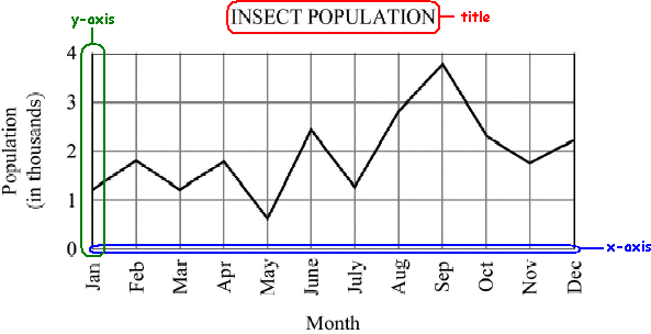
Look at the line graph below. You should be able to identify the title and axes. The x-axis always runs horizontally and the y-axis always runs vertically. Each axis is labeled with evenly spaced units. The units give you the measurements for points on a graph. By simply looking at the title and axes, can you tell what this graph is about?
When you read any graph, follow the following steps:
1. Look at the graph title. What is the graph about? The graph gives the population of insects in a particular area.
2. Look at the axes. What units are used in the graph? What quantities do they measure? In this graph, the y-axis measures the population of insects by the thousand. The x-axis measures time in months.
3. Read the key or legend, if the graph has one.
4. Look at the graph and try to interpret it. See if the lines go up or down between two points. Notice how steep a line is. The steeper the line is, the faster the variables are changing. In this graph, the insect population seems to fluctuate between January and July before growing rapidly in August and September. After September, the insect population drops.
Finding a Point on a Graph
Finding the value for a point on a graph is very simple. For example, imagine that you are asked to find the change in the population of the world in 1990.
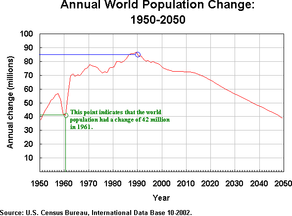
- Begin by finding the year 1990 on the graph.
- Trace the gridline for 1990 up to the line depicting population change.
- Then, trace that line horizontally over to the y-axis.
The point is about halfway between 90 and 80 million, so the population change of the world in 1990 was about 85 million. When points are between gridlines, you may have to estimate the point's value.
What if you were asked to find the years at which the population change was 65 million? In this case, you would start by finding 65 million on the y-axis. Follow this line horizontally across until it intersects with the population change line. Trace down to find the value for this point on the y-axis.
Rates of Increase and Decrease
Frequently, you may be asked to describe whether a graph shows an increase or decrease in value. In general, if a graph is sloping up to the right, it shows an increase. If it slopes down to the right, it is showing a decrease. What does a perfectly horizontal line show? It is staying at the same y-axis value, so it shows no change.
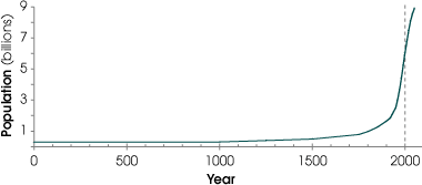
Increases or decreases can be rapid or slow. Lines with a steep slope are changing rapidly while lines that are flatter are not changing rapidly. Look at the graph above. What is the population at year 1000? At 1500? At 2000?
The increase in population from 1000 to 1500 is so small that you probably had a hard time estimating different values for these years. The population increased slowly over these years; the line did not have a very large vertical increase. You probably noticed a big change between years 1500 and 2000. The line begins to have a steep slope, indicating a rapid change.
![]()
![]()
![]()