Learn
Curved Line Displacement-Time Graph
In the first section, you saw some of the ways a displacement-time graph can be analyzed.
Let's look at another example, which involves more than just straight lines.

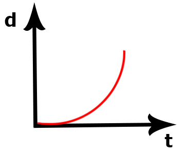
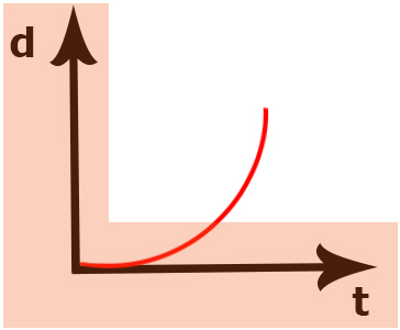
Take a look at this displacement-time graph. Notice it has time on the x-axis and displacement on the y-axis.
What is one big difference you notice from the previous section?
Hopefully you see that this line is curved, not straight like the lines in the previous example.

What does the curved line mean?
The line in this graph is curving upwards.
What does this tell us?
Well, it tells us a few things:
First, it tells us that the displacement is positive. The curve starts at 0 displacement and ends further up the graph so this is a positive displacement value.

Second, we know that the velocity is increasing. Because this is a curve, not a straight line, the slope is increasing as the curve gets steeper. This means velocity is increasing too!
What do we call it when velocity is changing?
That's right – acceleration! So this graph also shows that the object is accelerating.
Putting It All Together
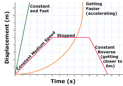
Let's put everything we've learned about displacement- time graphs together into one graph that shows many of the different things we have discussed.

Look at each line and identify what motion is it showing. You will need to interpret graphs like these later on your own.
Review
Check out GPB Segment D: Graphing Motion to review what you have learned so far.