Learn
Rates of Increase and Decrease
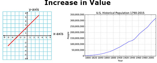
Frequently, you may be asked to describe whether a graph shows an increase in value or decrease in value. In general, if a graph is sloping up to the right, it shows an increase. This is shown in the graph below.

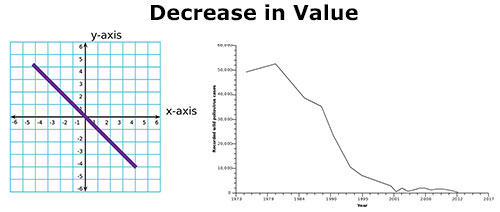
If it slopes down to the right, it is showing a decrease. This is shown in the graph below.

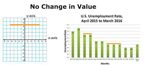
What does a perfectly horizontal line show? It is staying at the same y-axis value, so it shows no change, as seen below.

Charts presenting real data rarely have long periods of no change. In our example chart above detailing the U.S. unemployment rate from April 2015 to March 2016, there are periods of no change in the data, which are emphasized by an orange line.
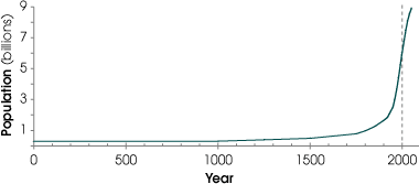
Increases or decreases can be rapid or slow. Lines with a steep slope indicate a rapid change, while lines that are flatter are not changing rapidly. Look at the graph below. What is the population at year 1000? At 1500? At 2000?

The increase in population from 1000 to 1500 is so small that you probably had a hard time estimating different values for these years. The population increased slowly over these years; the line did not have a very large vertical increase. You probably noticed a big change between years 1500 and 2000. The line begins to have a steep slope, indicating a rapid change.