Earlier in the course, you learned that the economy goes through a business cycle. It is the interaction of the Aggregate Demand and Aggregate Supply curves, and the changes in each curve, that explain periods of growth and recession in the economy.
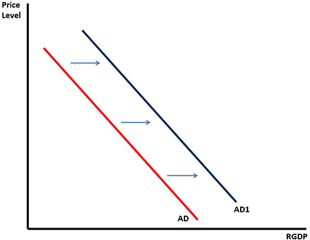
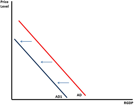
An increase in Aggregate Demand is a shift of the curve to the right (top graph below), while a decrease in Aggregate Demand is a shift of the curve to the left (bottom graph below).
This graph shows an increase in the aggregate demand, with the line shifting to the right. That means that at each price level, there is a higher demand. Remember, the demand curve is a downward curve, with lower demand at higher prices and higher demand at lower prices. See larger version of aggregate demand, shift right graph here.This graph shows a decrease in the aggregate demand, with the line shifting to the left. That means that at each price level, there is a lower demand. Remember, the demand curve is a downward curve, with lower demand at higher prices and higher demand at lower prices. See larger version of aggregate demand, shift left graph here.
Determinants
The determinants which shift the Aggregate Demand curve are summarized in the table below.
Determinant
AD will shift to the right
AD will shift to the left
1. Consumer Spending
Household Wealth
Increases
Decreases
Consumer Taxes
Decreases
Increases
Interest Rates
Decreases
Increases
Expectations of the future
The economy will perform well in the future
The economy will not perform well in the future
2. Investment Spending
Interest Rates
Decreases
Increases
Business Taxes
Decreases
Increases
3. Government Spending
Government Spending
Increases
Decreases
4. Net Exports
Net = exports - imports
Exports increase or imports decrease
Imports increase or Exports decrease
Aggregate Supply
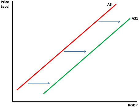
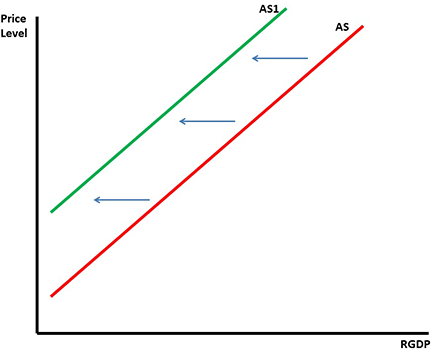
An increase in Aggregate Supply is a shift of the curve to the right (top graph below), while a decrease in Aggregate Supply is a shift of the curve to the left (bottom graph below).
This graph shows an increase in the aggregate supply, with the line shifting to the right. That means that at each price level, there is a higher demand. Remember, the supply curve is an upward curve, with higher demand at higher prices and lower demand at lower prices. See larger version of aggregate supply, shift right graph here.This graph shows a decrease in the aggregate supply, with the line shifting to the left. That means that at each price level, there is a lower demand. Remember, the supply curve is an upward curve, with higher demand at higher prices and lower demand at lower prices. See larger version of aggregate supply, shift left graph here.
Determinants
The determinants which shift the Aggregate Supply curve are summarized in the table below.
Determinant
AS will shift to the right
AS will shift to the left
1. Cost of Inputs
Cost of land, labor or capital
Decreases
Increases
2. Government Policies
Subsidies
Increases
Decreases
Regulations
Decreases
Increases
Business Taxes
Decreases
Increases
3. Environmental Changes
Inflationary expectations
Expect inflation to decrease
Expect inflation to increase
Natural Disasters
When disasters destroy businesses
4. Productivity
Technology
Increases
Decreases
Education
Increases
Decreases
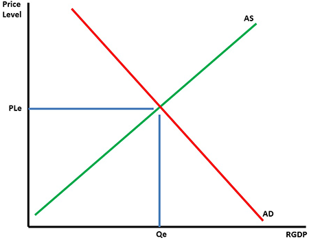
Equilibrium
Putting the Aggregate Demand and Aggregate Supply curves together shows the equilibrium point of Price Level and Quantity of RGDP.
The equilibrium illustration consists of the aggregate demand curve, labeled AD, which slopes from the upper left to the lower right, and the aggregate supply curve, labeled AS, which slopes from the origin of the X and Y axes to the upper right. The AD curve and AS curve intersect at what is known as the equilibrium point indicating that total demand matches total supply. The equilibrium point is connected to the vertical price axis by a horizontal line and is labeled on the x axis as price level equilibrium or PLe. The equilibrium point is connected to the real GDP Y axis by a vertical line. This quantity equilibrium point is labeled as Qe on the Y axis. See larger version of equilibrium graph here.
Knowing where equilibrium begins, represented by PLe and Qe, we can now identify what happens to Price Level and Output with changes in Aggregate Demand and Aggregate Supply.
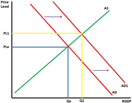
The graph below shows an increase in Aggregate Demand with Aggregate Supply staying the same.
The typical supply and demand graph consists of intersecting supply and demand curves. The equilibrium point is established at that intersection. That point is connected to the vertical price axis and horizontal quantity axis by axis-equilibrium connectors. They mark the price and quantity values represented by the equilibrium point. There are occasions in which the aggregate supply or aggregate demand curves move in response to non-price determinants. If there is an increase in aggregate income for example, the aggregate demand curve will shift to the right indicating an increase in total demand due the increased propensity to consume. Once the new AD curve has moved to the right thus establishing a new equilibrium point on the aggregate supply curve, new price and quantity connector lines must be drawn to connect the new equilibrium point to the vertical price line and the horizontal quantity line. In this case, the price-connector line is drawn from the new equilibrium point to a point that higher on the vertical price axis. The quantity-connector line is drawn from the new equilibrium point to the horizontal quantity axis further to the right indicating a higher quantity. See larger version of aggregate demand increase, aggregated supply the same graph here.
Identifying the new Price Level as PL1 and the new Output as Q1, we see that the price level and output have both increased. To produce more goods businesses will have to hire more workers so employment will increase.
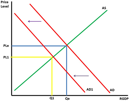
The graph below shows an decrease in Aggregate Demand with Aggregate Supply staying the same.
The typical supply and demand graph consists of intersecting supply and demand curves. The equilibrium point is established at that intersection. That point is connected to the vertical price axis and horizontal quantity axis by axis-equilibrium connectors. They mark the price and quantity values represented by the equilibrium point. There are occasions in which the aggregate supply or aggregate demand curves move in response to non-price determinants. If there is an increase in the personal income tax rates for example, the aggregate demand curve will shift to the left indicating a decrease in total demand due the decreased propensity to consume. Once the new AD curve has moved to the left thus establishing a new equilibrium point that is lower on the aggregate supply curve, new price and quantity connector lines must be drawn to connect the new equilibrium point to the vertical price line and the horizontal quantity line. In this case, the price-connector line is drawn from the new equilibrium point to a point that is lower on the vertical price axis. The quantity-connector line is drawn from the new equilibrium point to the horizontal quantity axis farther to the left indicating a lower quantity. See larger version of aggregate demand decrease, aggregate supply the same graph here.
Identifying the new Price Level as PL1 and the new Output as Q1, we see that the price level and output have both decreased. To produce less goods businesses will have to hire fewer workers so employment will decrease.
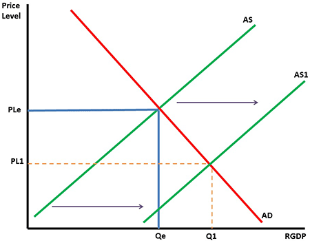
The graph below shows an increase in Aggregate Supply with Aggregate Demand staying the same.
The typical supply and demand graph consists of intersecting supply and demand curves. The equilibrium point is established at that intersection. That point is connected to the vertical price axis and horizontal quantity axis by axis-equilibrium connectors. They mark the price and quantity values represented by the equilibrium point. There are occasions in which the aggregate supply or aggregate demand curves move in response to non-price determinants. If there is an increase in the adoption of new technology, the aggregate supply curve will shift to the right indicating an increase in total supply due to increased productivity at lower costs. Once the new AS curve has moved to the right, thus establishing a new equilibrium point that is lower on the aggregate demand curve, new price and quantity connector lines must be drawn to connect the new equilibrium point to the vertical price line and the horizontal quantity line. In this case, the price-connector line is drawn from the new equilibrium point to a point that is lower on the vertical price axis. The quantity-connector line is drawn from the new equilibrium point to the horizontal quantity axis farther to the right indicating a higher quantity. See larger version of aggregate supply increase, aggregate demand the same graph here.
Identifying the new Price Level as PL1 and the new Output as Q1, we see that the price level has decreased while the output has increased. To produce more goods businesses will have to hire more workers so employment will increase.
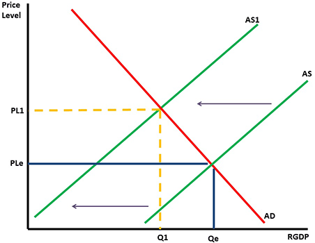
The graph below shows a decrease in Aggregate Supply with Aggregate Demand staying the same.
The typical supply and demand graph consists of intersecting supply and demand curves. The equilibrium point is established at that intersection. That point is connected to the vertical price axis and horizontal quantity axis by axis-equilibrium connectors. They mark the price and quantity values represented by the equilibrium point. There are occasions in which the aggregate supply or aggregate demand curves move in response to non-price determinants. If there is an increase in the cost of inputs such as an increase in the minimum wage, for example, the aggregate supply curve will shift to the left indicating a decrease in total supply due to higher production costs. Once the new AS curve has moved to the left, thus establishing a new equilibrium point that is higher on the aggregate demand curve, new price and quantity connector lines must be drawn to connect the new equilibrium point to the vertical price line and the horizontal quantity line. In this case, the price-connector line is drawn from the new equilibrium point to a point that is higher on the vertical price axis. The quantity-connector line is drawn from the new equilibrium point to the horizontal quantity axis farther to the left indicating a lower quantity. See larger version of equilibrium shift with decrease in aggregate supply graph here.
Identifying the new Price Level as PL1 and the new Output as Q1, we see that the price level has increased while the output has decreased. To produce less goods businesses will hire fewer workers so employment will decrease.
Long Run Aggregate Supply
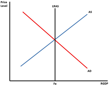
It is now time to introduce the Long Run Aggregate supply curve. This graph is located below.
This curve is a vertical line that represents the full employment of resources.
When the economy is at equilibrium the AS and AD curves intersect over the LRAS curve, like in the graph below.
The long-run aggregate supply curve is similar to the traditional supply-demand curve with a few exceptions. While the X axis is still labeled as the price axis, the horizontal Y axis is now labeled the real gross domestic product or RGDP axis. The traditional positively sloped aggregate supply line runs from the lower left to the upper right and the negatively sloped aggregate demand line runs from the upper left down to the lower right. Add to those curves, the long-run aggregate supply line, or LRAS, which runs from the RGDP line vertically through the equilibrium point at the intersection of the AS and AD curves parallel with the vertical price axis. When the economy is at equilibrium, the AS and AD curves settle over the LRAS which intersects the Y axis RGDP line at full employment or FE. It is important to note that, in the long run, changes in price have no impact on the movement of the LRAS curve. In the long run, the output potential of the economy is the same at any point along the price level line. Subsequent illustrations will detail non-price determinants which do cause the short-run AS and AD curves to move to the left the left in the case of recession or to the right to reflect an economy in inflation. See larger version of long-run aggregate supply curve graph here.
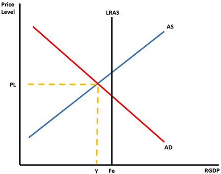
To show graphically what a recession looks like, we draw the short run equilibrium to the left of full employment.
In this situation, the output in the economy has decreased.
With a decrease in output, businesses don't need as many workers so unemployment increases.
With the decrease in employment and economic activity, the price level in the economy will tend to be lower.
This situation is represented graphically below.
Although long-run aggregate supply curve is relative unresponsive to price change in the short term, there are forces which cause the short-run aggregate supply and short-run aggregate demand curves to move in relation to the LRAS curve. Suppose for example the stock market declines sharply. In that scenario, the average citizen suffers a loss of income and thus is less likely to consume discretionary goods. In that case the AD curve shifts off of the LRAS curve to the left and establishes a new equilibrium point farther down the AS curve. When the price-connector line labeled PL is drawn from the new equilibrium point to the vertical X or price axis, it meets the price line at a point lower on the axis reflecting falling prices. When the quantity connector line is drawn from the RGDP line to the new equilibrium point, it strikes the RGDP line farther to the left reflecting falling output at lower employment and prices. The gap between the LRAS and the new equilibrium point is called a recessionary gap reflective of the decrease in production. The new lower output point is labeled Y on the RGDP line. The Y point means total output or the dollar value of the output. Show larger version of graph here.
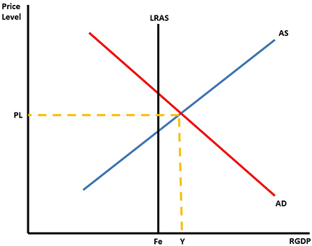
To show graphically what inflation in an economy looks like, we draw the short run equilibrium to the right of full employment.
In this situation, the output in the economy has increased.
With an increase in output, businesses have to pay more to workers and other resources since both are in short supply.
In this situation, price level, output, and employment all increase.
This situation is represented graphically below.
Although long-run aggregate supply curve is relative unresponsive to price change in the short term, there are forces which cause the short-run aggregate supply and short-run aggregate demand curves to move in relation to the LRAS curve. Suppose for example there is a significant decrease in the cost of energy such as the current energy revolution caused by hydraulic fracturing. In that scenario, the cost of production and transportation decreases. In that case the AS curve shifts off of the LRAS curve to the right and establishes a new equilibrium point farther down the AD curve. When the price-connector line labeled PL is drawn from the new equilibrium point to the vertical X or price axis, it meets the price line at a point lower on the axis reflecting falling prices due to lower production costs. When the quantity connector line is drawn from the RGDP line to the new equilibrium point, it strikes the RGDP line farther to the right of the LRAS curve reflecting increasing output at higher employment. The gap between the LRAS and the new equilibrium point is called an inflationary gap reflecting increased production. The new higher output point is labeled Y on the RGDP line. The Y point means total output or the dollar value of the output. See larger version of graph here.
Factors
What factors change the LRAS curve
Long-Run Aggregate Supply curve? Generally the factors that change the SRAS curve will move the LRAS curve. The general difference is whether or not the factors have an effect for enough time to have changes take place.
For instance, a bad storm that destroys businesses will cause a shift in the SRAS curve. However, it won't be long until the businesses are up and running again. Changes in the LRAS would be unlikely.
On the other hand, an increase in immigration will cause the SRAS curve
Short-Run Aggregate Supply curve and LRAS curve to shift. The new labor resources would add a short term and long term addition to the Aggregate Supply because of the increase in resources.
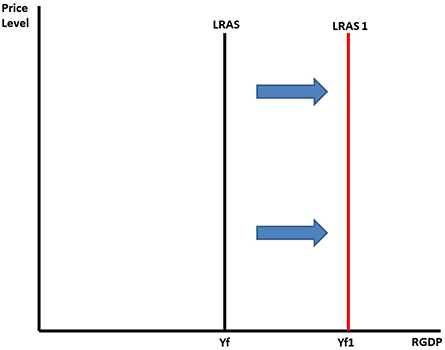
Just like with the supply curve, an increase in the LRAS for a country is a shift of the LRAS curve to the right.
This graph is simply of a vertical long-run aggregate supply curve which runs parallel to the vertical price level axis. The original curve is labeled Yf on the horizontal real GDP line which symbolizes national output at full employment. There is a second vertical LRAS curve which runs parallel to the vertical price level axis and the original LRAS curve. This new LRAS curve is labeled Yf1 on the horizontal RGDP line. The new curve is located to the right of the original LRAS curve indicating that the economy is producing at a new level of efficiency. It is a manifestation of the movement of an economy outside the production possibilities frontier or PPF. The movement of the LRAS to the right might be in response to an improvement of resource quality, an improvement in resource quantity, or an enhancement in quality of one of the factors of production. The movement is generally gradual for example in the case of the increase of population following World War II. In that case, the LRAS shifted to the right as the new members of society became consumers, workers, and producers. See larger version of LRAS curve to the right graph here.
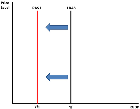
A decrease in the LRAS curve is a shift of the curve to the left.
This graph is simply of a vertical long-run aggregate supply curve which runs parallel to the vertical price level axis. The original LRAS curve is labeled Yf on the horizontal real GDP line which symbolizes real GDP output at full employment. There is a second vertical LRAS curve which runs parallel to the vertical price level axis and the original LRAS curve. This new LRAS curve is labeled Yf1 on the horizontal RGDP line. The new curve is located to the left of the original LRAS curve indicating that the economy is producing at a lower level of efficiency. It is a manifestation of the retreat of an economy inside the production possibilities frontier or PPF that you learned about earlier. The movement of the LRAS to the left might be in response to a deterioration of resource quality, a decrease in resource quantity, or a decline in quality of one of the factors of production. The movement is generally gradual for example in the case of the increase in retirement of the aging World War II Baby-Boom population. See larger version of LRAS curve to the left graph here.
Classical Economics
With your knowledge of the AS and AD curves, and the position of equilibrium relative to Full Employment, we will now turn our attention to correcting for inflationary or recessionary times. While there are different economic theories about the best way to correct an economy, we will focus on only two: Classical Economics and Keynesian Economics.
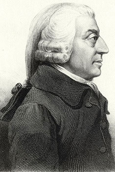
Classical economics is a theory introduced by the "Father of Economics," Adam Smith. His idea states that if you leave the economy alone, any sort of problem will correct itself.
Adam Smith
The basics of classical economics:
Aggregate supply determines output, which basically means if a business makes an item than the income will be created for people to buy the product. In other words, supply creates its own demand.
There is no role for government in an economy, because the economy will self-regulate itself.
Prices and wage are flexible.
The economy will achieve full employment in the long run.
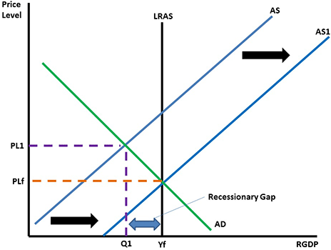
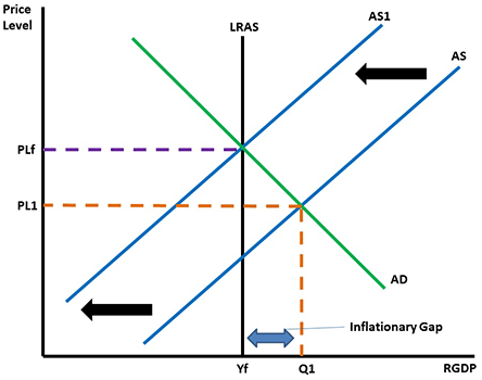
The principles of classical economics are represented in the graph below when the economy is in a recession. We start with the economy in a recession, which is identified by PL1 and Q1 in the graph below.
According to a classical economist, with the unemployment in the economy, eventually wages and prices of resources will decrease.
When the costs of inputs decrease, the AS curve will shift to the right and achieve equilibrium again at a lower price level (PLf) and a higher output (Yf).
The graph depicts an economy in recession. Price is on the y-axis and GDP is on the x-axis. Remember that the price and quantity prior to the recession are identified as PL1 and Q1. With the recession, the aggregate supply line shifts to the right, changing the intersection of the aggregate supply line and aggregate demand. Since the aggregate demand line slopes downward, a shift to the right of the aggregate supply line means that the equilibrium point moves down and to the right. As the price of input materials decreases, the output of products will increase, until equilibrium is reached. At the new equilibrium point, price levels are lower and the production quantity or output is higher. The change in product, or shift on the x-axis, is the recessionary gap. See larger version of recession graph here.
The principles of classical economics can also be illustrated when the economy is booming or doing well. The graph below represents the ideas of a classical economist in a boom time. A booming economy and high inflation is represented by PL1 and Q1 in the graph below.
According to a classical economist, with low unemployment and a higher price level, eventually the cost of wages and resources will increase.
With the cost of inputs increasing the AS curve will shift to the left and achieve a new equilibrium at a higher price level (PLF) and a lower output (Yf).
The graph depicts an economy experiencing inflation Price is on the y-axis and GDP is on the x-axis. Remember that the price and quantity prior to the boom are identified as PL1 and Q1. With the boom, the aggregate supply line shifts to the left, changing the intersection of the aggregate supply line and aggregate demand. Since the aggregate demand line slopes downward, a shift to the left of the aggregate supply line means that the equilibrium point moves up and to the left. As the price of input materials increases, the output of products will decrease, until equilibrium is reached. At the new equilibrium point, price levels are higher and the production quantity or output is lower. The change in product, or shift on the x-axis, is the inflationary gap. See larger version of inflation gap here.
These two examples show the basic beliefs of a classical economist – if you leave the economy alone, any problems will correct themselves.
Keynesian Economics
The ideas of classical economics lasted until the Great Depression of the 1930s. It was at this time that Keynesian Economics (pronounced "CANES-ee-un") was introduced to President Franklin Roosevelt by John Maynard Keynes. The persistence and the depth of the depression could not be explained by classical economists. Keynes (pronounced "Canes") offered a new approach to looking at the economy. He believed the economy would not achieve full employment in the long run, as espoused by classical economists, unless the government stepped in and affected aggregate demand.
The basics of Keynesian economic thoughts:
Aggregate demand determines output, which basically means if people don't have the money to buy items businesses won't produce anything. In other words, demand creates supply.
There is a management role for the government in the economy. The government needs to increase spending and decrease taxes in a recession and decrease spending and increase taxes when there is inflation.
Prices and wages are sticky, and don't adjust so quickly.
The famous quote attributed to Keynes about waiting for the economy to fix itself, is "In the long run we are all dead."
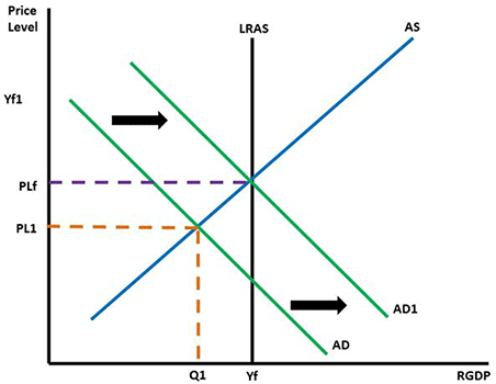
You can see the idea of Keynes in the graph below. Start with the economy in a recession, which is identified by PL1 and Q1 in the graph below.
According to Keynes, with unemployment in the economy, the government needs to increase aggregate demand by lowering taxes and increasing spending.
By lowering taxes, consumers have more disposable income, which means their consumption will increase.
Since the components of Aggregate Demand include C and G, increasing both will shift AD to the right.
A new equilibrium will be achieved with a higher price level (PLf) a greater output (Yf).
The graph depicts an economy in recession. Price is on the y-axis and GDP is on the x-axis. Remember that the price and quantity prior to the recession are identified as PL1 and Q1. With the recession, the government should increase aggregate demand. This will shift the line to the right, changing the intersection of the aggregate supply line and aggregate demand. Since the aggregate demand line slopes downward, a shift to the right of the aggregate demand line means that the equilibrium point moves up and to the right. As the price of input materials increases, the output of products will increase, until equilibrium is reached. At the new equilibrium point, price levels are higher and the production quantity or output is higher. Note the difference here from classical economics, where the supply line shifts, not the demand line. See larger version of graph here. See larger version of recession graph here.
You can see the idea of Keynes in the graph below. Start with the economy experiencing high inflation, identified by PL1 and Q1 in the graph below.
According to Keynes, with inflation the biggest problem in the economy, the government needs to decrease aggregate demand by increasing taxes and decreasing spending.
By increasing taxes, consumers have less disposable income, which means their consumption will decrease.
Since the components of Aggregate Demand include C and G, decreasing both C and G will shift AD to the left.
A new equilibrium will be achieved with a lower price level(PLf) a smaller output (Yf).
The graph depicts an economy experiencing inflation. Price is on the y-axis and GDP is on the x-axis. Remember that the price and quantity prior to the boom are identified as PL1 and Q1. With the boom, the aggregate demand line shifts to the left, changing the intersection of the aggregate supply line and aggregate demand. Since the aggregate demand line slopes downward, a shift to the left of the aggregate demand line means that the equilibrium point moves down and to the left. As the price of input materials decreases, the output of products will decrease, until equilibrium is reached. At the new equilibrium point, price levels are lower and the production quantity or output is lower. Note the difference here from classical economics, where the supply line shifts, not the demand line. See larger version of inflation graph here.
Monetary Policy
The other entity tasked with trying to help the economy recover from a recession or control inflation is the Federal Reserve.
The money supply can be manipulated to help correct the economy. The graph below shows this correction.
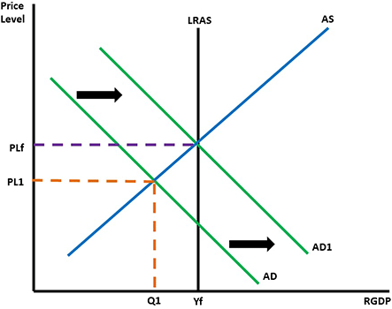
We will start with the economy in a recession, which is identified by PL1 and Q1 in the graph below.
The Federal Reserve, faced with a stagnant economy, or an economy that is not growing, and high unemployment, would use an expansionary money policy would help to correct the situation.
By increasing the money supply and decreasing the interest rates, businesses and consumers would borrow more money.
By increasing the money supply and decreasing the interest rates, businesses and consumers would pay to borrow more money.
By increasing consumption and investment, Aggregate Demand would shift to the right.
The economy would achieve a new equilibrium at a higher price level (PLf) and a higher output (Yf).
The graph depicts an economy in recession. Price is on the y-axis and GDP is on the x-axis. Remember that the price and quantity at the beginning of the recession are identified as PL1 and Q1. With the recession, the government increases money supply, which pushes an increase in aggregate demand. This will shift the line to the right, changing the intersection of the aggregate supply line and aggregate demand. Since the aggregate demand line slopes downward, a shift to the right of the aggregate demand line means that the equilibrium point moves up and to the right. As the price of input materials increases, the output of products will increase, until equilibrium is reached. At the new equilibrium point, price levels are higher and the production quantity or output is higher. Note that the graph itself is identical to the similar situation in Keynesian economics, in which the shift in demand (not supply) drives the new equilibrium point. See larger version of recession graph shifting to the right here.
Keeping in mind the tools of the Federal Reserve, you can see how manipulating the money supply will help correct the economy. This is shown in the graph below.
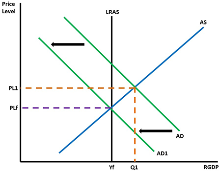
We start with the economy experiencing high inflation, which is identified by PL1 and Q1 in the graph below.
The Federal Reserve, faced with high inflation, would use a contractionary monetary policy to take money out of the economy to correct the situation.
By decreasing the money supply and increasing interest rates, it would cost businesses and consumers more to borrow money.
By decreasing consumption and investment, Aggregate Demand would shift to the left.
The economy would achieve a new equilibrium at a lower price level (PLf) and a lower output (Yf).
The graph depicts an economy experiencing inflation. Price is on the y-axis and GDP is on the x-axis. Remember that the price and quantity prior to the boom are identified as PL1 and Q1. With the boom, the federal reserve decreases the moeny supply and increases interest rates. This will push the aggregate demand line to the left, changing the intersection of the aggregate supply line and aggregate demand. Since the aggregate demand line slopes downward, a shift to the left of the aggregate demand line means that the equilibrium point moves down and to the left. As the price of input materials decreases, the output of products will decrease, until equilibrium is reached. At the new equilibrium point, price levels are lower and the production quantity or output is lower. Note that the graph itself is identical to the similar situation in Keynesian economics, in which the shift in demand (not supply) drives the new equilibrium point. See larger version of recession graph shifting to the left here.
One problem in the economy that confounds both classical and Keynesian economists is called stagflation. Stagflation is caused by shifting the AS curve to the left.
In this situation, you will see an increase in the price level and an increase in unemployment. This situation is the worst because not only are people out of a job, but everything costs more!
The problem for Keynesian economists was evident during the 1970s with the oil crisis. With the cost of oil increasing rapidly the cost of everything increased, the economy slowed and people were put out of work. Looking at the graph shows that any attempt to increase AD by the government would have made inflation even worse.
The classical solution of allowing the economy to correct itself was met with much criticism from the people who were suffering.
In the case of the 1970s, the Federal Reserve eventually implemented a contractionary monetary policy to eradicate the high inflation from the economy. The 1970s were followed by periods of high economic growth during the 1980s and 1990s.
Watch Stagflation (28:44) fro Annenberg Learnerto gain a perspective on stagflation.
Review
Now that you have a basic understanding of the problems for an economy and how monetary and fiscal policy are used to either stimulate or slow down the economy, read Monetary and Fiscal Policy from The Social Studies Help Center to see a more detailed summary.
With your understanding of fiscal and monetary policy, watch Keynes vs. Hayek to hear a recent discussion on the disagreements over Classical and Keynesian Economics. Keep in mind that Friedrich Hayek is a classical economist. The word austerity is the term describing the cutback in government spending going on in some European countries that are trying to get debt and government spending under control.