Learn
Demand Elasticity
Elasticity measures how sensitive consumers are to price change.
- Demand is elastic when a change in price causes a large change in demand.
- Demand is inelastic when a change in price causes a small change in demand.
- Demand is unit elastic when a change in price causes a proportional change in demand.
Study the elasticity chart below and notice that in the left hand column is labeled the Determinants of Elasticity. These five determinants or factors will help determine whether the product is elastic or inelastic. The second column gives you some examples of products.
| Determinants of Elasticity | Examples |
|---|---|
Is the product a luxury or a necessity?
|
|
What is the time horizon? Do you need the product immediately?
|
|
Does the purchase comprise a large or small part of your income?
|
|
Are there close substitutes?
|
|
How big is the market?
|
|
Download a copy of the Determinants of Elasticity and Examples chart for your notes here.
Beyond the Elasticity Chart: The Total Expenditures Test
Charts are helpful to determine elasticity, but are not exact. Indeed, a product as simple as a hot dog can be both elastic (hamburger is a close substitute) and inelastic (at a ballpark). Because the business owner and government entity needs to know the exact elasticity, a total receipts test or total revenue test is used and a calculation is derived.
The formula is: Price × Quantity = Total Receipts (Revenue)
For example, selling 20 items (quantity) at $2.00 each (price) equals $40.00 (total receipts or total revenue). $2.00 × 20 items sold = $40.00
| Situation | Observation | Business Owner Application | Government Entity Application |
|---|---|---|---|
| Price Increases ↑ Total Receipts Increases ↑ |
Arrow in the same direction. Product is inelastic. | If you sell an inelastic product and want to make more money, raise your price. If Harvard wants more money, the trustees just need to raise tuition. It works! |
Raise taxes on inelastic products such as cigarettes and alcohol; these are known as "sin" taxes. Raise taxes on gasoline. All of these "extra" taxes are known as "excise" taxes. |
| Price Decreases ↓ Total Receipts Decreases ↓ |
Arrow in the same direction. Product is inelastic. | If you sell an inelastic product and drop your price, you will lose money. If you sell a one-in-a-kind product, don't lower your price! |
Don't drop the extra taxes on inelastic products or the revenue will fall. |
| Price Increases ↑ Total Receipts Decreases ↓ |
Arrow in the opposite directions. Product is elastic. | If you sell an elastic product and raise your price, people will stop buying your product. | Do not tax elastic products. People will buy the substitute. |
| Price Decreases ↓ Total Receipts Increases ↑ |
Arrow in the opposite directions. Product is elastic. | If you sell an elastic product and you lower your price, people will buy your product and you will make more money. Consumers are responding to the price break and are buying more. Everyone is happy. | If Congress taxed less on certain items, we would buy more of that item. Tax less on the interest earned on investing in the stock market, and more people would invest in the stock market, example. |
Download a copy of Elasticity Chart Using Total Receipts Test chart for your notes here.
Graphing Demand
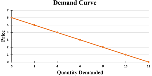
The Demand Curve
Notice the demand curve slopes downward. This shows that people are normally willing to buy less of a product at a high price and more at a low price. According to the law of demand, quantity demanded and price move in opposite directions.
Change in Quantity Demanded
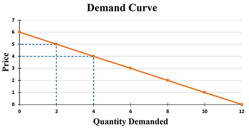
Change in the quantity demanded due to a price change occurs ALONG the demand curve. In other words, when the price of a good is changed, the quantity demanded changes but you do not change the demand.

Look at the graph below.
- At $5, the quantity demanded of a product is 2.
- A decrease in the price of the product to $4 will lead to an increase in the quantity demanded of the product from 2 to 4.
To learn more about the demand curve, watch the Demand Curve (5:06) video below.
Open Demand Curve in a new tab
Non-price Determinants
In the last lesson, we talked about several factors that may go beyond changing the quantity demanded but instead will change the entire demand for a good/product/service. These factors (or non-price determinants) are:
- Change in income
- Change in taste
- A price change in a related product (either because it is a substitute or complement)
- Consumer expectations
- The number of buyers
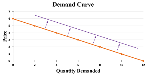
Look at the graph below. When a change in demand for the good takes place, the entire demand curve shifts. For example, suppose that consumer income increases. As a result, the demand for a product at all prices will increase.
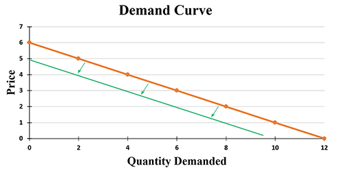
Demand may also decrease due to changes in factors other than price. For example, if public taste changes, making a product undesirable, a decrease in demand for that product will occur. See the graph below.
Demand Graph Scenario #1
Look at the graph below. Assume a nation is experiencing a severe drought with no sign of relief in the near future. What will happen to the demand curve for umbrellas? (Note: D1 is the original demand curve.)
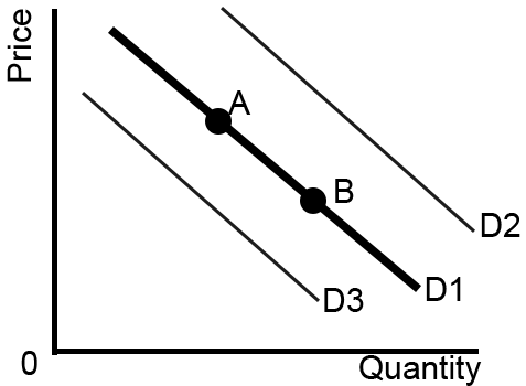
Select one:
- A to B
- B to A
- D1 to D2
- D1 to D3
- No Change
Answer: d. D1 to D3
Explanation: The drought is a non-price determinant, so there is not just a change in quantity demanded, but instead the demand decreases causing a shift in the graph.
Demand Graph Scenario #2
Look at the graph below. To help sell umbrellas, stores offer a 50% discount. What will happen to the demand curve for umbrellas? (Note: D1 is the original demand curve.)

Select one:
- A to B
- B to A
- D1 to D2
- D1 to D3
- No Change
Answer: a. A to B
Explanation: Remember, a change in the quantity demanded due to a price change occurs ALONG the demand curve. So, the price of umbrellas was lowered in order to sell a higher quantity of umbrellas. Therefore, the best choice is A to B.