Learn
PPF
What is a PPF Graph?
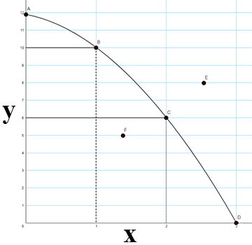
A common way for economists to illustrate the opportunity costs of decisions is with the production possibilities frontier (PPF). The PPF graphically represents the point at which an economy is most efficiently producing its goods and services and, therefore, allocating its resources in the best way possible. Here is an example of a PPF:

This graph is a curve extending from Point A on the positive y-axis to Point D on the positive x-axis.
- Point A represents the maximum number of product Y you can produce, while Point D represents the maximum number of product X you can produce.
- Points B and C lie along the curve and represent the number of X and Y that can be produced together.
We make the following assumptions about the PPF:
- If you use all of your resources efficiently, then you will produce at a point on the line (A, B, C, D).
- The graph is only good for the moment it is drawn. Eventually new resources will be found or new technology will be developed that will change the boundary of the PPF. This is the principle of Ceteris Paribus which simply means all other things being equal.
- A limitation of the PPF is that it can only compare two types of products.
- This graph shows that choices are necessary.
- This graph shows opportunity costs.
- To have more of Y, we will have less X.
- To have more of X, we will have to give up some Y.
- If you are not using all of your available resources you will be at a point inside the curve (F). This point is possible, but inefficient.
- Although Point E is currently unattainable given our current factors of production (land, labor, capital, and entrepreneurship), it can be reached in the future with increases in one or more of the following: productivity, trade, technology, and capital stock.
- A point outside the curve shows that you can't have all of the X and Y that you want. You have to make a choice.
Open Production Possibilities Frontier (PPF) (8:37) in a new tab
Practical Application
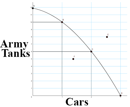
Now that we know the basics of the PPF we can talk about a practical application. In an earlier section we talked about Guns v. Butter. Even nations must make choices. The graph below shows a country's decision points. A country can have a very large military (army tanks), but have no resources left for civilian goods, which in this case is represented by cars.

This Production Possibilities Frontier (PPF) graph is a curve extending from Point A on the positive y-axis to Point D on the positive x-axis.
- The y-axis represents army tanks and the x-axis represents cars.
- Point A represents the maximum number of army tanks that can be produced if no cars are being produced. Point A is 12.
- Point D represents the maximum product of cars you can produce without producing army tanks. Point D is 3 cars.
- Point B lies on the curve and shows that you can produce 10 army tanks and 1 car.
- Point C lies on the curve and shows that you can produce 6 army tanks and 2 cars.
- Point F lies inside the curve, representing a less than efficient use of resources. It would allow the production of 5 tanks and 1 car.
- Point E lies outside the curve and cannot be acheived.
Consider these questions:
- Which point(s) on the graph are possible to attain?
- Which point(s) on the graph are efficient?
- Which point(s) on the graph are possible but inefficient?
- What is a historical example of Point F? Explain.
- Is Point E attainable?
PPF Graphs and Opportunity Costs
With the basic questions of what the graph represents, we can now illustrate the concept of opportunity cost.
- If the government chooses to move from Point A to Point B, what is the cost? The cost would be the loss of two tanks. We do gain one car, but we lose the resources necessary to produce two tanks.
- What is the cost of going from Point B to Point C? The cost is four tanks. We do gain another car, but now we must give up the resources for four tanks.
As you can now see the idea of opportunity cost is represented very well by the PPF. To get more of one item you must give up another item.