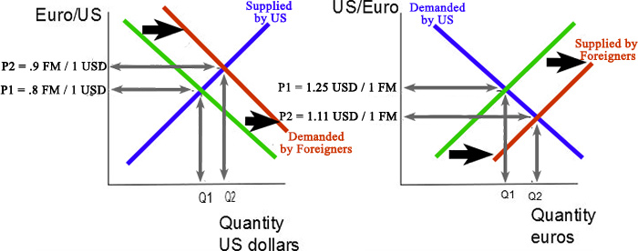
These graphs are foreign exchange rate graphs. The first one is the Dollar Graph. It shows the quantity of dollars supplied on the x axis with a supply line raising from left to right. The y axis shows the ratio of euros or foriegn money to US dollars. In this case, the demand for US dollars from foreigners increases, shifting the demand line to the right. This causes the equilibrium point to shift to the right and up. So, the quantity of US Dollars supplied will increase. Likewise, the ratio of foreign money to US Dollars increases.
The second graph is a Foreign Money Graph. It shows the quantity of foreign money (in this case, Euros) supplied on the x axis with a supply line raising from left to right. The y axis shows the ratio of US dollars to euros. In this case, more Euros will be supplied to the US to buy US Dollars. This shifts the supply line to the right, causing the equilibrium point to shift lower on the demand curve. This will shift the ratio of foreign money to the US dollars down, from 1.25 USD / FM to 1.11 USD / FM.
![]()