The Demand Curve

Notice the demand curve slopes downward. This shows that people are normally willing to buy less of a product at a high price and more at a low price. According to the law of demand, quantity demanded and price move in opposite directions.
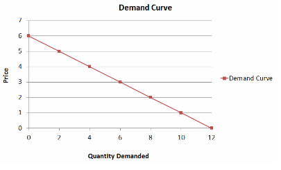
Image of a Demand curve. The quantity demanded is on the x-axis and the price is on the y-axis. When price is high, the quantity demanded is low. As price decreases, demand increases.


Change in Quantity Demanded

Change in the quantity demanded due to a price change occurs ALONG the demand curve. In other words, when the price of a good is changed, the quantity demanded changes but you do not change the demand.

Image of a Demand curve. The quantity demanded is on the x-axis and the price is on the y-axis. When price is high, the quantity demanded is low. As price decreases, demand increases.

Look at the graph below. At $5, the quantity demanded of a product is 2. A decrease in the price of the product to $4 will lead to an increase in the quantity demanded of the product from 2 to 4.
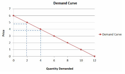
 

Image of a Demand curve. The quantity demanded is on the x-axis and the price is on the y-axis. When price is high, the quantity demanded is low. As price decreases, demand increases.

To learn more about the Demand curve, watch Demand Curve (5:06).

Non-price Determinants

In the last lesson, we talked about several factors that may go beyond changing the quantity demanded but instead will change the entire demand for a good/product/service. These factors (or non-price determinants) are:

  • Change in income
  • Change in taste
  • A price change in a related product (either because it is a substitute or complement)
  • Consumer expectations
  • The number of buyers

Look at the graph below. When a change in demand for the good takes place, the entire demand curve shifts. For example, suppose that consumer income increases. As a result, the demand for a product at all prices will increase.

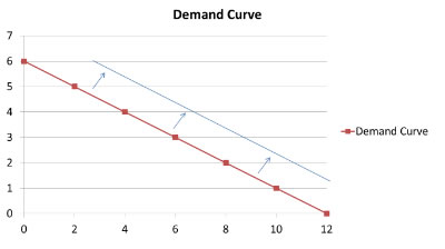
Image of a Demand curve shift. The quantity demanded is on the x-axis and the price is on the y-axis. When price is high, the quantity demanded is low. As price decreases, demand increases, making this a line that runs downward from left to right. In the original line, at a price of $6, the quantity demanded is 0; at $4, the quantity demanded is 4; at $3, the quantity demanded is 6; at $2 the quantity demanded is 8. In the shifted line, the quantity demanded at $6 is 4; at $4 the quantity demanded is 7; at $3 the quantity demanded is 9; at $2 the quantity demanded is 11, The shifted line is moved to the right on the graph.

Demand may also decrease due to changes in factors other than price.
For example, if public taste changes, making a product undesirable, a decrease in demand for that product will occur. See the graph below.

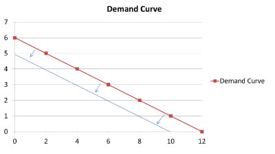
Image of a Demand curve shift. The quantity demanded is on the x-axis and the price is on the y-axis. When price is high, the quantity demanded is low. As price decreases, demand increases, making this a line that runs downward from left to right. In the original line, at a price of $6, the quantity demanded is 0; at $4, the quantity demanded is 4; at $3, the quantity demanded is 6; at $2 the quantity demanded is 8. In the shifted line, the quantity demanded at $6 is 0; at $4 the quantity demanded is 2; at $3 the quantity demanded is 4; at $2 the quantity demanded is 6. The entire line is shifted to the left.


Demand Graph Scenario #1

Look at the graph below. Assume a nation is experiencing a severe drought with no sign of relief in the near future. What will happen to the demand curve for umbrellas? (Note: D1 is the original demand curve.)
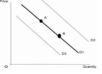
This is a demand curve showing shifts in demand. D1 is the original demand line. It contains two points - A, which represents a higher price and lower demand and B, which represents lower price and higher demand. Line D2 shows an increase in demand- in other words, a higher quantity demanded for a given price. This line is above D1. Line D3 represents a decrease in demand, or a lower quantity demanded for a given price. It is below line D1.

A. A to B
B. B to A
C. D1 to D2
D. D1 to D3
E. No Change

Answer: D. D1 to D3
Explanation: The drought is a non-price determinant, so there is not just a change in quantity demanded, but instead the demand decreases causing a shift in the graph.


Demand Graph Scenario #2

Look at the graph below. To help sell umbrellas, stores offer a 50% discount. (Note: D1 is the original demand curve.)

This is a demand curve showing shifts in demand. D1 is the original demand line. It contains two points - A, which represents a higher price and lower demand and B, which represents lower price and higher demand. Line D2 shows an increase in demand- in other words, a higher quantity demanded for a given price. This line is above D1. Line D3 represents a decrease in demand, or a lower quantity demanded for a given price. It is below line D1.

A. A to B
B. B to A
C. D1 to D2
D. D1 to D3
E. No Change

Answer: A. A to B
Explanation: Remember, a change in the quantity demanded due to a price change occurs ALONG the demand curve. So, the price of umbrellas was lowered in order to sell a higher quantity of umbrellas. Therefore, the best choice is A to B.