Learn
|
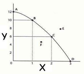
Watch Production Possibilities Curve, Part 1 (9:08) to learn about the basics of the production possibility curve (also known as the production possibility frontier). Watch Production Possibilities Curve, Part 2 (4:27) to learn more about the production possibility curve (also known as the production possibility frontier). A common way for economists to illustrate the opportunity costs of decisions is with the production possibilities frontier (PPF). The PPF graphically represents the point at which an economy is most efficiently producing its goods and services and, therefore, allocating its resources in the best way possible. Here is an example of a PPF:
We make the following assumptions about the PPF:
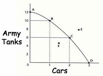
Now that we know the basics of the PPF we can talk about a practical application. In an earlier section we talked about Guns v. Butter. Even nations must make choices. The graph below shows a country's decision points. A country can have a very large military (Army Tanks), but have no resources left for civilian goods, which in this case is represented by Cars.
Consider these questions: Which point(s) on the graph are possible to attain? Which point(s) on the graph are efficient? Which point(s) on the graph are possible but inefficient? What is a historical example of point F? Explain. With the basic questions of what the graph represents we can now illustrate the concept of opportunity cost. If the government chooses to move from point A to point B, what is the cost? The cost would be the loss of two tanks. We do gain one car, but we lose the resources necessary to produce two tanks. What is the cost of going from point B to point C? The cost is four tanks. We do gain another car, but now we must give up the resources for four tanks. As you can now see the idea of opportunity cost is represented very well by the PPF. To get more of one item you must give up another item. |

