Learn
Non-Linear Functions
Not all data forms a straight line or an "almost" straight line. Data whose plotted points do not form a straight line are called non-linear. In some cases, a trend will be on a curve rather than a line. Some will produce a curved line while others will have a curved line that forms a parabola. In math, when we try and find a trendline or a curved trendline and its equation for best fit, it is called regression. Regression just means the model used to observe data to predict new values. If the points form a curved line, it is deemed a non-linear regression.
Not all models of data produce trends or correlations. If data points are "all over the place," there is no trend. If there is no trend in the data, then there is no relationship, and it would be hard to make predictions.
For example, suppose you plot the points of a high school team's football players' weights and heights. The table of values might look something like this.
| Player | Height | Weight |
|---|---|---|
| 1 | 62 inches | 100 lbs. |
| 2 | 65 inches | 250 lbs. |
| 3 | 66 inches | 125 lbs. |
| 4 | 70 inches | 145 lbs. |
| 5 | 72 inches | 195 lbs. |
| 6 | 68 inches | 200 lbs. |
Plotting these points on a coordinate plane, see graph:
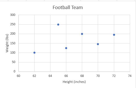
You can see that there is not really a trend between players' height and weight. You cannot draw a line of best fit through the points; if you draw a curved line, it would continually go up and down. Because there is no trend, there is no relationship between the football players' heights and weights. Because there is no trend, no formula would be available to make predictions or determine outcomes. You could not predict from these numbers the weight of a football player who is 6 foot 8 inches tall (80 inches).
Special Types of Non-Linear Functions
There are three special types of non-linear functions:
- exponential function
- logarithmic function
- quadratic function
With these functions, there will be a trend, but the trend will not be in a straight line.
An exponential function will show either a curved line that rises or falls. For exponential growth, as the input increases, the output increases at an increasing rate. For exponential decay, as the input increases, the output decreases at a faster rate. Let's look at an example of exponential growth.
A new business has opened downtown. Obviously, the day before opening, they would have 0 customers. During the first month of operation, they had on average 20 customers per day. The second month, because word began to spread about the business, they had an average of 50 customers a day. In the third month, they increased their advertising budget and saw an average of 95 customers per day. In the fourth month, between referrals and advertising, they saw an average of 200 customers per day. They tracked average number of customers through the first 7 months of operation. The table of values and the graph look like this.
| Month | Average Number of Customers |
|---|---|
| 0 | 0 |
| 1 | 20 |
| 2 | 50 |
| 3 | 95 |
| 4 | 200 |
| 5 | 300 |
| 6 | 450 |
| 7 | 800 |
See the graph of points plotted from table of values above.
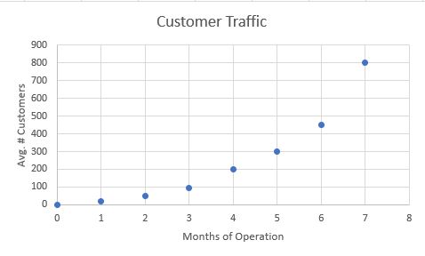
Is there a trend, and if so, what is it?
If you connect the dots, there is a trend, but it is a curved line rather than a straight one. Just as with a line of best fit, you do not have to "hit" every point, you just need to draw as smooth a line as possible to connect them.
The trend is that the longer this business was open, the more potential business they had. Using the curve of best fit, you could predict that in month 8 that the average number of customers in the store that month would be above 800.
Realistically, at some point, those numbers will begin to level off or decrease which would allow you to predict something else entirely. Given the data you have at the moment, you know that this business start-up is doing extremely well and is getting exponentially more potential customers each month. What you will see if you plot the points is a curve rather than a line. We call this a curve of best fit, and we can use an equation to predict other values.
Open Determine the Curve of Best Fit in a new window
Note: The presentation may take a moment to load.
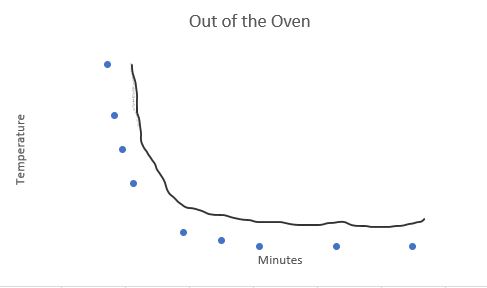
An exponential curve can show exponential growth or exponential decay. It's useful when data points grow (or fall) at extremely fast rates. A logarithmic function can also increase or decline, but as the input increases or decreases, the output increases or decreases at a decreasing rate. (Rate of change gets less and less each time.) Think about baking cookies. You cannot eat them when you first take them out of the oven because they are too hot. They cool fast enough so that you don't have to wait long, but they do stay "warm" for a long time. A graph of this function would look similar to this:
Determine the Line of Best Fit
Knowledge Check #1
The table shows the number if farms operating in the United States from 1998 through 2006.
| Year (since 1998) | Number of Farms (in thousands) |
|---|---|
| 0 | 2192 |
| 1 | 2187 |
| 2 | 2167 |
| 3 | 2149 |
| 4 | 2135 |
| 5 | 2127 |
| 6 | 2113 |
| 7 | 2009 |
| 8 | 1089 |
Use Geogebra's spreadsheet to find the line of best fit.
Step 1: In the spreadsheet enter the Years in column A and the Number of Farms in column B.
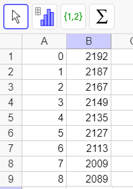
Step 2: Highlight the range of cells from A1:B9.
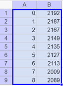
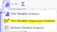
Step 3: Click on the bar chart and choose Two Variable Regression Analysis.
Step 4: Below Regression Model, click on the down arrow and choose Linear.

Step 5: You should now have an equation of the form y = mx + b below the Regression Model.
y = ?
Answer: y = -17.9333x + 2201.5111
Knowledge Check #2
Mary decides to run a 5K road race every Saturday morning for the next two months. The table shows the number of miles she runs per week, along with her weekly 5K results.
| Miles Run (per week) | 5K Time (min) |
|---|---|
| 10 | 42 |
| 12.5 | 40 |
| 15 | 36 |
| 17.5 | 31 |
| 20 | 30 |
| 22.5 | 27 |
| 25 | 26 |
Use Geogebra's spreadsheet to find the line of best fit.
y = ?
Answer: y = -1.1429x + 53.1429
Knowledge Check #3
The table shows the average daily temperature of a small town in Alabama since January 1st.
| Days | Temperature (°F) |
|---|---|
| 0 | 62 |
| 2 | 60 |
| 4 | 67 |
| 6 | 63 |
| 8 | 81 |
Use Geogebra's spreadsheet to find the line of best fit.
y = ?
Answer: y = 2.05x + 58.4
Quadratric Equations
Not all trends will constantly go one way or another. For example, think of shooting an arrow. If you shoot the arrow up, it will go up for a certain distance for a certain amount of time, but then, because of gravity, it will change directions and fall for a certain amount of time until it reaches the ground.
A new product typically goes through four stages:
- introduction
- growth
- maturity
- decline
In the beginning, sales for a new product will be slow. Once the target market is aware of the product it will sell more or be in the growth stage. The maturity stage, when most of your target market owns the product, is usually when a few people buy either a replacement, or you have some stragglers who waited to purchase the product. The decline stage means that the market is saturated and either everyone who is going to buy the product has it, or the new and improved version came out, so the original is no longer selling. Graphs for both situations, still have a trend line, but it is in the shape of a parabola.
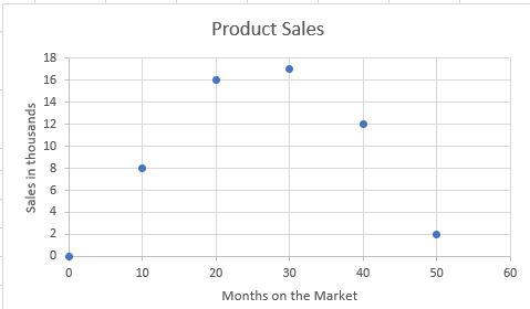
There is a relationship and a trend between the months on the market and sales figures. Sales of the product continued to increase until month 30 and then declined through month 50. The prediction would be that in month 60 it might be back at zero and not sell at all. At this point, the company would have to decide either to stop production or upgrade the product to increase sales.
When you plot points that form the shape of a parabola that opens upward or downward, you can draw a curve of best fit and use the quadratic equation to make decisions and predict outcomes.