Learn
Organizational Charts
An organizational chart displays the relationships within an organization, such as the managers in an office, the people they manage, and to whom they report. Organizational charts are easy to create using SmartArt graphics, which are professionally designed graphics that organize and display information.
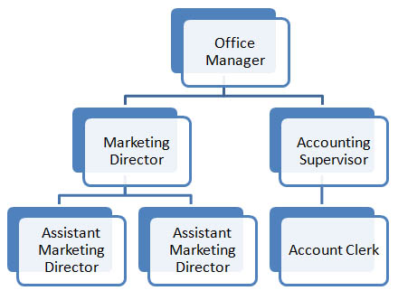
A traditional organizational chart uses rectangles or other shapes connected by lines to represent positions within an organization.
- High-level positions are placed at the top of the chart.
- Solid lines are used to show direct-reporting relationships; dotted lines show indirect relationships.
Here's an example organizational chart:
Adding SmartArt in PowerPoint
You can add SmartArt diagrams in Microsoft Office programs like Word and PowerPoint.
- In the Insert tab, select SmartArt in Illustrations section.
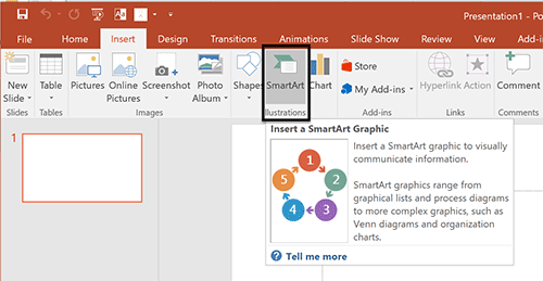
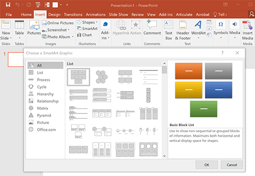
See larger version of step 1 in PowerPoint here. - Select from the 'Choose a SmartArt Graphic' menu.
See larger version of step 2 in PowerPoint here.
Adding Diagrams in Google Slides
In Google Slides, you won't see the term 'SmartArt' but you can still create organizational charts in this program.
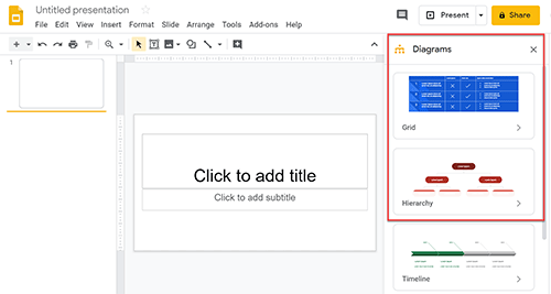
- In Google Slides select the Insert tab and then selecting Diagram from the dropdown menu.
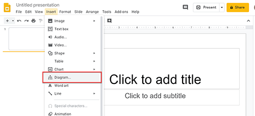
See larger version of step 1 in Google Slides here. - Different diagram options will appear in a menu on the right side of your screen.
See larger version of step 2 in Google Slides here.