Learn
Interpreting Graphs
We read a graph from left to right just like we read words in a sentence. Put your finger on the first dot in the picture.
Now move it to the right to the last dot in a straight path. Did you move your finger up or down as you made your way to the last dot?
It is very evident that the line moves upward. This means that there is an increase.

In algebra, you were told that a function is increasing if, as x increases, y also increases. This is a good illustration of that statement.
However, there is more to this story than there is an increase. If this is your stock report, you will want to break it down in intervals or sections.
For instance, let's assume that each of these dots are spaced on monthly intervals. It appears that there could be a slight drop from the first dot to the second one. There is definitely a drop from the fourth one to the fifth one.
When you see the drops, you are actually losing money. Some people look at their reports constantly and feel the pain of loss every time there is a dip in the line. Others look at the beginning and end to see if there was an overall gain. Financial advisors will tell you that you should look at the rise or fall over a long period of time.
This "long period of time" could possibly be a report for a day, a month, a year, or ten years.
- If it is for a day, it could have little or no effect on your investments.
- The same could be true if it is for a month.
- If it is for a year, you may want to consider making some changes.
- And, if it is for ten years, you definitely should consider doing something else with your money.

Even though there are several occasions that an increase is shown, if you do like what we did with the first graph in this lesson and go directly from the first point to the last one, it is evident that the line is moving downward which means that there is an overall loss.
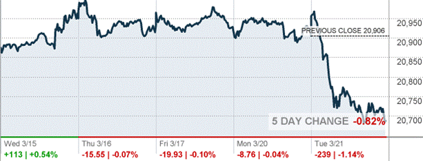
Look at the graph below. Notice that the information is covering five days. There are many changes each day in the value of the stock.
- On Wednesday there was a nice gain which is noted in green.
- There were losses each of the remaining days with a significant loss on Tuesday.
The graph below shows data over a two year period. There is a steady climb, a sharp decline, and then another steady climb. Would you say that this has been a good investment?
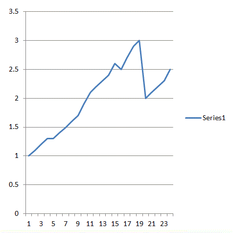
Let's assume that the numbers for the y-axis are for thousands. It appears that there was an initial $1,000 investment. The investment grew to $3,000, fell to $2,000 and has grown back to $2,500. This is a 150% increase in two years. That is a great return on your money. Although it would have been great not to have lost the money, the overall increase is great.