Learn
Scatter Plots and Linear Functions
Living in Alabama (even if you don't live on the coast), you have experienced hurricane season. Meteorologists look for patterns and relationships using data from past hurricanes to predict the path of the current and future storms.
A good way to see a relationship in data is with a scatter plot. This is a graph that shows the relationship between two variables and how closely these data points get to a line of best fit or trend line. Scatter plots will often show at a glance whether a relationship exists between two sets of data.
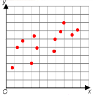
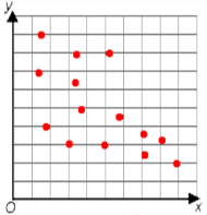
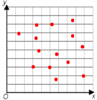
Let's look at example scatter plots that show the three types of relationships that two sets of data may have: positive, negative, or no relationship.
Positive Correlation
A positive correlation means that both sets of data increase together. For example: The number of calories burned and the time spent exercising have a positive correlation; the more you exercise, the more calories are burned.

Negative Correlation
A negative correlation means that one set increases as the other set decreases. For example: The age of a car and its value have a negative correlation; as the age of the car increases, the value of it decreases.

No Correlation
Sometimes, the data points are scattered and do not show any relationship. This means the variables have no correlation. For example: A person's height and hair color have no effect on one another.

Creating and Interpreting Scatter Plots Example #1
Open Create and Interpret Scatter Plots Example #1 in a new tab
Creating and Interpreting Scatter Plots Example #2
Open Create and Interpret Scatter Plots Example #2 in a new tab